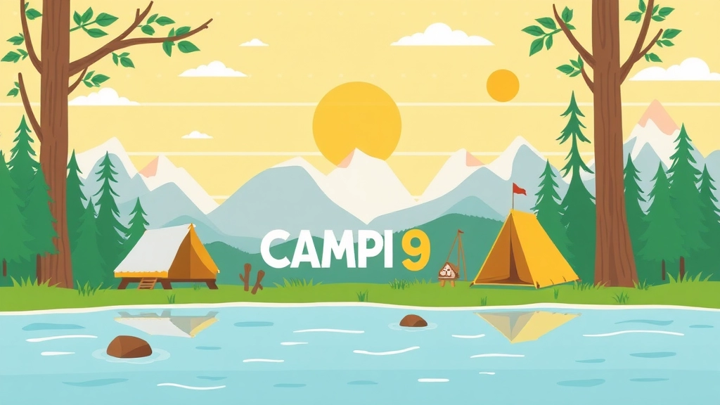
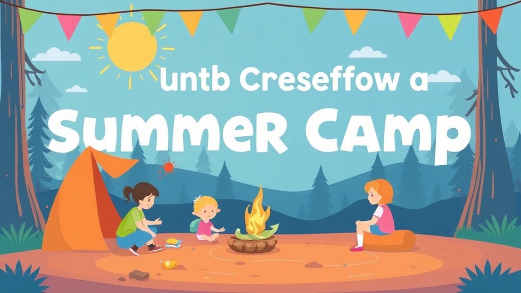
Designing an Eye-Catching Summer Camp Banner
Designing an eye-catching summer camp banner is more than just picking bright colors and flashy fonts. It’s about creating a visual story that captures the essence of fun and adventure while conveying essential information. From selecting the right colors and fonts to incorporating engaging images and graphics, this guide will walk you through every step to make your banner not only attractive but also effective.
Essential Elements to Include
We’ll cover essential elements to include on your banner, such as camp details and call-to-action prompts, and explore ideal banner sizes for different locations. You’ll also learn about durable printing materials and placement strategies to maximize visibility.
Ready to Design?
Whether you’re creating a physical or digital banner, these tips will ensure your summer camp stands out and attracts attention. Ready to design the ultimate summer camp banner? Let’s dive in!
Designing an Eye-Catching Summer Camp Banner
Alright, so you’re tasked with creating a summer camp banner. Where do you even start? Let’s break it down. Designing an eye-catching summer camp banner isn’t just about slapping on some bright colours and calling it a day. It’s about crafting something that screams fun and excitement, while also being informative. For more inspiration, check out these eye-catching summer camp poster design tips.
What Makes a Banner Stand Out?
First off, think about the questions and worries people might have. Will this banner grab attention? Will it convey the right message? Let’s tackle these head-on.
Key Elements for a Standout Design:
- Clarity is Key: You want your message to be clear from a distance. No one’s squinting to read your banner.
- Bold and Bright: Use colours that pop. Summer’s all about vibrancy, so don’t hold back.
- Keep it Simple: Too much information can be overwhelming. Stick to the essentials.
Real Talk: What Works?
Imagine you’re chatting with a friend over coffee. You’d tell them:
- Use Contrasting Colours: Make sure text stands out against the background. Think yellow on blue or white on green.
- Choose Readable Fonts: Avoid overly decorative fonts. Go for bold and simple. Check out the best summer camp fonts and how to use them for more guidance.
- Include a Call to Action (CTA): Encourage people to sign up or visit your website.
Story Time
I remember a camp that used a banner with a huge, smiling sun and kids playing. It was simple, yet effective. Parents immediately got the vibe: fun, safe, and engaging.
Breaking Down the Design Process
Here’s a quick checklist to guide you:
- Define Your Message: What’s the main takeaway? Is it the dates, activities, or registration info?
- Select the Right Images: Use high-quality photos or graphics that resonate with the camp’s theme.
- Layout Matters: Arrange elements so they’re easy to digest. Consider using a grid system.
- Test It Out: Show your design to a few people. Do they get it instantly? If not, tweak it.
Keep It Fresh
Remember, your banner is the first impression. Make it count. Keep it real, keep it engaging, and most importantly, make sure it reflects the fun and adventure of your summer camp.
Essential Elements to Include on Your Banner
Alright, let’s get into it.
Ever find yourself staring at a banner, thinking, “What am I even looking at?”
Yeah, we’ve all been there.
So, what should you include on your summer camp banner to make sure that doesn’t happen?
1. Camp Name and Logo
- Camp Name: Make it big, make it bold. People need to know who you are.
- Logo: This is your brand’s face. It’s got to be there, front and centre.
2. Dates and Times
- Start and End Dates: When does the fun begin and end? Clear as day.
- Daily Schedule: Do you run from 9 to 5? Or are there special events at certain times? Lay it out.
3. Location
- Address: Where’s the magic happening? Include the full address.
- Map or Directions: A small map or a QR code linking to directions can be super helpful.
4. Contact Information
- Phone Number: For those who prefer a chat.
- Email Address: For folks who like to type it out.
- Website: More details? They’ll head to your site.
5. Key Activities
- Highlights: What’s the big draw? Zip-lining? Arts and crafts? List the top activities.
- Unique Selling Points: What makes your camp stand out? Maybe it’s the only one with a petting zoo.
6. Call to Action (CTA)
- Sign Up Now: You’ve got to tell them what to do next. Make it urgent and clear.
- Early Bird Specials: Any discounts for signing up early? Mention it.
7. Social Media Handles
- Icons and Links: Where can they follow you? Instagram, Facebook, Twitter? Pop those icons and handles on there.
8. Testimonials or Reviews
- Quotes: A few words from happy campers or parents can build trust.
- Ratings: If you’ve got a five-star rating, flaunt it.
Your banner needs to scream, “This is the place to be this summer!”
Keep it simple, keep it clear, and make sure it’s got all the info people need to make a quick decision.
And remember, every element on your banner should have a purpose.
No fluff, just the good stuff.
Ready to make a killer summer camp banner?
Let’s do this.
Choosing the Right Colours and Fonts
Alright, let’s dive into the nitty-gritty of choosing the right colours and fonts for your summer camp banner. This might seem like a small detail, but trust me, it can make or break your banner’s effectiveness. So, how do you pick the perfect combo? Let’s break it down.
Why Colours and Fonts Matter
Ever looked at a banner and thought, “Wow, that looks amazing”? Or maybe, “Ugh, what were they thinking?” That’s the power of colours and fonts. They’re not just aesthetic choices; they communicate your message, set the tone, and can even evoke emotions. Here’s what you need to consider:
What Are Your Campers and Parents Looking For?
First off, think about your audience. Parents and kids are your main targets here. Parents want to know it’s a safe, fun, and enriching environment. Kids want to see excitement and adventure. So, your colours and fonts should reflect that.
Colour Choices: Keep It Bright, Keep It Fun
Colours are the first thing people notice. They can grab attention, convey emotions, and even affect decisions. Here’s how to pick the right ones:
- Bright and Cheerful: Think sunny yellows, sky blues, and vibrant greens. These colours scream summer and fun.
- Contrast is Key: Use contrasting colours to make your text stand out. Dark text on a light background or vice versa.
- Consistency: Stick to a colour scheme that matches your camp’s branding. This helps in building recognition.
Font Choices: Easy to Read, Easy to Remember
Fonts can either make your text pop or make it a headache to read. Here’s what to keep in mind:
- Readability is Crucial: Choose fonts that are easy to read from a distance. Sans-serif fonts like Arial or Helvetica are usually a safe bet.
- Size Matters: Make sure your main message is in a larger font size. Subheadings can be smaller but still readable.
- Limit Your Fonts: Stick to two or three fonts max. Too many fonts can make your banner look cluttered and unprofessional.
Combining Colours and Fonts: Best Practices
Now that you’ve got your colours and fonts, how do you put them together?
- Hierarchy: Use different font sizes and weights to create a hierarchy. Your main message should be the most prominent.
- Alignment: Keep your text aligned to make it look organised. Left-aligned text is usually the easiest to read.
- Spacing: Don’t cram your text. Use ample spacing to make it easy on the eyes.
Real-Life Examples
Imagine a summer camp banner with a bright yellow background, a large, bold font in navy blue for the camp’s name, and a playful, cursive font in white for the tagline. The contrast makes it pop, and the fonts are easy to read. This combination not only looks appealing but also communicates a fun and inviting atmosphere. For more inspiration on creative ideas, check out our creative summer camp sign ideas.
And if you’re looking for additional tips on making your summer camp memorable, don’t miss our guide on creating lifetime memories at summer camp.
Incorporating Images and Graphics
Ever wondered why some banners just grab your attention and others don’t? It’s all about the visuals.
Images and Graphics – that’s the secret sauce.
But how do you nail it?
Why Images and Graphics Matter
First off, let’s talk about why you even need them.
- Catch the Eye: Images make your banner pop.
- Tell a Story: A picture is worth a thousand words, right?
- Boost Engagement: People are more likely to stop and read.
Picking the Right Images
Not all images are created equal. Here’s what you need:
- High Quality: Blurry images? Big no-no.
- Relevant: Make sure they scream “summer camp.”
- Diverse: Show different activities – swimming, hiking, crafting.
Adding Graphics
Graphics are like the cherry on top. They add flair and fun.
- Icons: Think tents, campfires, and backpacks.
- Illustrations: Custom drawings can give a unique touch.
- Logos: Your camp’s logo should be front and centre.
Placement Matters
Where you put your images and graphics can make or break your banner.
- Top and Centre: Key visuals should be at eye level.
- Balance: Don’t overcrowd one side. Spread them out.
- Call to Action: Make sure your main message isn’t hidden.
Real-Life Example
I remember this one summer camp banner I saw at a park. It had a huge image of kids roasting marshmallows. Instantly, I wanted to know more. That’s the power of the right image.
So, what’s the takeaway?
Use images and graphics to make your summer camp banner not just seen, but remembered.
Keep it simple, keep it relevant, and watch your engagement soar.
Effective Banner Sizes for Different Locations
Ever find yourself wondering, “What size should my summer camp banner be?” You’re not alone. Getting the banner size right is crucial for making sure it’s seen and remembered. Let’s dive into the nitty-gritty of banner sizes that work best for different locations.
Why Size Matters
First off, let’s address why size is a big deal:
- Visibility: A banner that’s too small won’t catch anyone’s eye. Too big, and it might look out of place.
- Readability: You want people to read your message without squinting.
- Placement: Different spots require different dimensions. A banner hanging on a fence needs a different size than one on a building.
Common Banner Sizes and Their Ideal Locations
Here are some popular banner sizes and where they work best:
2′ x 4′ (0.6m x 1.2m)
- Perfect for: Small spaces like community bulletin boards or inside buildings.
- Pros: Easy to handle, cost-effective.
- Cons: Limited visibility from a distance.
3′ x 6′ (0.9m x 1.8m)
- Perfect for: Outdoor events, park entrances, or school gates.
- Pros: Good balance of size and readability.
- Cons: Might be too small for very large open spaces.
4′ x 8′ (1.2m x 2.4m)
- Perfect for: Large fences, building sides, or across streets.
- Pros: Highly visible, great for grabbing attention.
- Cons: Requires more space and can be pricier.
5′ x 10′ (1.5m x 3m) and Up
- Perfect for: Major events, large open spaces, or high-traffic areas.
- Pros: Maximum visibility, makes a big impact.
- Cons: More expensive, requires strong support.
Custom Sizes
Sometimes, the standard sizes just don’t cut it. That’s where custom sizes come in. If you’ve got a unique location or a specific vision, go custom. Just make sure to:
- Measure the space accurately.
- Consider the viewing distance.
- Balance size with your budget.
Real-World Example
Imagine you’re setting up a summer camp banner for a local park event. You choose a 3′ x 6′ banner because it’s a good middle ground. You place it at the park entrance where everyone will see it as they walk in. Boom! You’ve got a banner that’s just the right size to attract attention without overwhelming the space.
Tips for Choosing the Right Size
Here are some quick tips to make sure you nail the size:
- Scout the location: See where your banner will go and measure the space.
- Think about the audience: Will they be walking by or driving? Adjust the size accordingly.
- Test readability: Print a small mock-up and see if you can read it from a distance.
By getting the size right, you’re setting yourself up for a successful summer camp promotion. The right banner size ensures your message is seen, read, and remembered. So next time you’re planning a banner, keep these tips in mind and you’ll be golden.
For more tips on promoting your camp, check out our guide on eye-catching summer camp flyers. And if you need help with the logistics, our complete guide to shuttle bus services for summer camps has you covered.
Printing and Material Options for Durability
Ever had a banner fall apart after just one week?
Yeah, me too.
Let’s make sure that doesn’t happen to your summer camp banner.
Why Durability Matters
First off, durability is key.
You don’t want your banner looking like it’s been through a storm after a few days.
A durable banner saves you money and keeps your camp looking top-notch.
Material Choices
Let’s dive into the materials.
Here’s what I’ve found to be the best options:
- Vinyl: This is the go-to. It’s tough, waterproof, and can handle the sun. Think of it as the Superman of banner materials.
- Mesh: Ideal for windy areas. The tiny holes let the air pass through, so your banner doesn’t turn into a sail.
- Fabric: Gives a premium look. Great for indoor displays but can work outdoors if you choose a weather-resistant option.
Printing Techniques
Now, onto printing.
The way your banner is printed can make a big difference:
- Digital Printing: This is the most common. It’s quick, cost-effective, and perfect for colourful designs.
- Screen Printing: Best for simple designs with few colours. It’s super durable and the colours really pop.
- UV Printing: Uses UV light to cure the ink. This makes it resistant to fading, which is great for banners that will be in direct sunlight.
Finishing Touches
Don’t forget the finishing touches.
These can add to the durability and overall look:
- Grommets: Metal rings at the corners for easy hanging. They prevent tearing and make it easy to secure your banner.
- Hemmed Edges: Reinforced edges that stop fraying. Think of it as giving your banner a little extra armour.
- Pole Pockets: If you’re planning to hang your banner on poles, these are a must. They make the banner look neat and professional.
Real-Life Example
I once had a camp director who went with a cheap, thin material.
Guess what?
It tore within a week.
He switched to vinyl with hemmed edges and grommets, and it lasted the whole summer.
Lesson learned.
Placement Strategies for Maximum Visibility
Wondering where to place your summer camp banner for maximum impact? Let’s be real â you could have the most eye-catching banner in the world, but if it’s stuck in a corner where nobody looks, it’s as good as invisible. So, here’s the lowdown on making sure your banner grabs all the attention it deserves.
Key Locations to Consider
- High-Traffic Areas: Think about where people naturally gather. Busy streets, main entrances, and popular community spots are gold mines for visibility.
- Eye-Level Placement: No one likes craning their neck or looking down. Keep your banner at eye level so it’s easy to spot and read.
- Near Related Activities: If there’s a local event or a spot where kids and parents frequently visit, like schools or parks, that’s your prime real estate.
- Roadside Visibility: If you’re placing your banner by the road, make sure it’s readable from a distance. Big, bold fonts and striking colours are your friends here.
- Online Platforms: Don’t forget the digital side. Placing your banner on social media pages, community websites, and local forums can drive a lot of traffic too.
Pro Tips for Killer Placement
- Scout Locations: Before hanging your banner, take a walk around the area. Look for places that get a lot of foot and vehicle traffic.
- Test Different Spots: Sometimes, the first spot you think of isn’t the best. Try a few different locations and see which one gets the most attention.
- Check the Lighting: Make sure your banner is well-lit, especially if it’s going to be up in the evening. Natural light is best, but street lights can work in a pinch.
- Avoid Clutter: Placing your banner in a busy, cluttered area can make it blend into the background. Find a spot where it stands out.
Stories from the Trenches
I remember a time when we placed a banner for a local summer camp right outside a popular ice cream shop. It was a hit! Parents and kids would stop by, see the banner, and talk about the camp while enjoying their treats. Lesson learned: find places where people are already relaxed and happy.
Keep It Fresh
Switch up your locations periodically. People get banner fatigue if they see the same thing in the same spot day after day. Moving it around keeps it fresh and noticeable.
For more tips on creating an effective summer camp banner, check out our section on Key Elements and DIY Ideas and Eye-Catching Summer Camp Flyers.
Tips for Creating a Digital Summer Camp Banner
Ever struggled with making a digital summer camp banner that actually grabs attention?
You’re not alone.
Let’s dive into some practical tips to make your banner pop.
Start with a Strong Headline
Your headline is the first thing people see.
Make it count.
- Keep it short and snappy.
- Use action words like “Join,” “Discover,” or “Explore.”
- Include the keyword: “summer camp banner.”
Use High-Quality Images
Images speak louder than words.
Choose visuals that scream “summer fun.”
- Bright, happy faces.
- Nature shots like lakes, forests, or campfires.
- Activities like hiking, swimming, or crafting.
Choose the Right Fonts and Colours
Fonts and colours can make or break your banner.
- Fonts: Go for easy-to-read and playful fonts.
- Colours: Stick to vibrant, summer-themed colours like blue, green, and yellow.
Keep It Simple
Don’t overload your banner with info.
- One main message.
- A clear call-to-action (CTA).
- Minimal text.
Use Contrast for Readability
Make sure your text stands out.
- Dark text on a light background or vice versa.
- Bold important words or phrases.
Optimise for Different Devices
Your banner should look good everywhere.
- Mobile-friendly design.
- Test on different screen sizes.
Add Social Proof
People trust people.
- Include testimonials from past campers.
- Showcase awards or recognitions.
Keep It Fresh and Fun
Your banner should reflect the spirit of summer camp.
- Use playful language.
- Incorporate seasonal trends like popular summer activities or themes.
Example
Imagine you’re chatting with a friend over coffee.
“Hey, remember that summer camp we went to as kids? Imagine capturing that excitement in a banner. Bright colours, smiling faces, and a big, bold ‘Join the Adventure!’ headline. That’s what we’re aiming for.”
Seasonal Trends and Themes for Summer Camp Banners
Alright, let’s dive into the nitty-gritty of seasonal trends and themes for summer camp banners. You’re probably wondering, “How do I make a banner that stands out and screams summer fun?” Well, let’s get into it.
What’s Hot This Summer?
First off, let’s talk about current trends. Every summer has its own vibe, and you want your banner to reflect that. Here are some trends you can’t ignore:
- Nature-Inspired Themes: Think lush greens, vibrant flowers, and serene lakes. People are craving the outdoors more than ever.
- Adventure and Exploration: Kids want to feel like they’re going on an epic journey. Use images of hiking, treasure hunts, or even space exploration.
- Retro and Vintage: Nostalgia sells. Incorporate elements from the ’80s or ’90s to tap into those feel-good vibes.
- Eco-Friendly and Sustainable: Parents are increasingly concerned about the environment. Highlight activities like recycling crafts or nature conservation.
Colour Schemes That Pop
Choosing the right colours can make or break your banner. Here are some colour schemes that are trending:
- Bright and Bold: Neon greens, electric blues, and vibrant yellows. These colours grab attention and scream summer fun.
- Pastels: Soft pinks, baby blues, and mint greens. These give a calming and inviting feel.
- Earth Tones: Browns, greens, and beiges. Perfect for nature-themed camps.
Fonts That Speak Volumes
Your font choice matters more than you think. Here are some font styles that are in vogue:
- Handwritten Fonts: They give a personal touch and are perfect for a casual, fun vibe.
- Bold and Chunky: These fonts are easy to read from a distance and make a strong statement.
- Retro Fonts: Again, tapping into that nostalgia can be a big win.
Incorporating Seasonal Elements
Now, let’s talk about seasonal elements that can make your banner pop:
- Summer Icons: Suns, flip-flops, ice creams, and beach balls. These instantly convey a summer theme.
- Nature Elements: Trees, mountains, rivers, and animals. Perfect for outdoor adventure camps.
- Activity Illustrations: Show kids doing camp activities like canoeing, archery, or roasting marshmallows.
Real-World Examples
Let me share a quick story. Last summer, I was helping a friend design a banner for his nature camp. We went with a nature-inspired theme using earth tones and images of kids hiking and exploring. The banner was a hit! Parents loved the eco-friendly vibe, and the camp saw a 20% increase in enrolments.
Key Takeaways
- Stay Current: Keep an eye on what’s trending.
- Choose the Right Colours: They should reflect the theme and be eye-catching.
- Font Matters: Make sure it’s readable and matches the vibe.
- Seasonal Elements: Incorporate icons and images that scream summer.
So, when you’re designing your summer camp banner, keep these trends and themes in mind. Trust me, it will make a world of difference. For more ideas on creating a captivating summer camp experience, check out our summer camp creative arts and crafts ideas and get inspired by the top summer camp games and activities guide.
Legal Considerations for Public Display of Banners
Ever wondered if slapping up a banner anywhere is cool?
Spoiler: It’s not.
Public display laws can get tricky, but let’s break it down.
What’s the Big Deal?
You can’t just hang your summer camp banner anywhere you fancy.
There are rules.
And breaking them can cost you.
Key Legal Points to Remember
- Local Regulations: Different areas have different rules. Check with your local council.
- Permits: Some locations need permits. No permit? No banner.
- Private Property: Always get permission. Don’t assume it’s okay.
- Content Restrictions: Some places have rules about what you can and can’t say.
Real Talk: Examples
- City Centres: Often have stricter rules. Think about traffic, visibility, and safety.
- Schools and Parks: Usually need special permissions. Make friends with the admin.
- Highways: Super strict. Safety first.
Why It Matters
Ignoring these rules can lead to:
- Fines: Nobody wants to waste money.
- Banner Removal: All that hard work, gone.
- Bad Rep: Not good for your camp’s image.
Pro Tips
- Do Your Homework: Know the rules before you print.
- Get Clear Permissions: Written is better than verbal.
- Stay Updated: Laws change. Keep in the loop.
Ready to dive into more banner tips? Check out our section on Creative Summer Camp Sign Ideas and Tips.
For more on making your camp stand out, explore our guide on Summer Camp Aesthetic: Key Elements and DIY Ideas.
Keep it legal, keep it visible, and keep it awesome.
FAQs about Creating an Effective Summer Camp Banner
What are the essential elements to include on a summer camp banner?
Your summer camp banner should include key elements such as:
- Camp Name and Logo: Make it big and bold.
- Dates and Times: Clearly state the start and end dates as well as the daily schedule.
- Location: Include the full address and, if possible, a map or QR code for directions.
- Contact Information: Phone number, email address, and website.
- Key Activities: Highlight the main attractions and unique selling points.
- Call to Action (CTA): Urge people to sign up and mention any early bird specials.
- Social Media Handles: Include icons and links to your social media pages.
- Testimonials or Reviews: Quotes and ratings from past campers or parents.
Why are images and graphics important for a summer camp banner?
Images and graphics are crucial because they:
- Catch the Eye: Make your banner stand out.
- Tell a Story: Convey a lot of information quickly.
- Boost Engagement: Encourage people to stop and read.
What types of images should I use on my summer camp banner?
Choose images that are:
- High Quality: Avoid blurry images.
- Relevant: Ensure they resonate with the theme of summer camp.
- Diverse: Show various activities like swimming, hiking, and crafting.
What materials are best for a durable summer camp banner?
The best materials for durability include:
- Vinyl: Waterproof and sun-resistant.
- Mesh: Ideal for windy areas.
- Fabric: Offers a premium look and can be weather-resistant if chosen correctly.
What printing techniques should I consider for my banner?
Consider the following printing techniques:
- Digital Printing: Quick and cost-effective, great for colourful designs.
- Screen Printing: Durable and vibrant, best for simple designs.
- UV Printing: Resistant to fading, ideal for banners exposed to sunlight.
What finishing touches can enhance my banner’s durability and appearance?
Enhance your banner with:
- Grommets: Metal rings for easy hanging and tear prevention.
- Hemmed Edges: Reinforced edges to prevent fraying.
- Pole Pockets: Ideal for hanging on poles, providing a neat and professional look.
How do I create an effective digital summer camp banner?
For a digital banner, focus on:
- Strong Headline: Keep it short and action-oriented.
- High-Quality Images: Use visuals that evoke summer fun.
- Fonts and Colours: Choose easy-to-read fonts and vibrant colours.
- Simplicity: Keep the message clear with minimal text and a strong CTA.
- Contrast: Ensure text stands out against the background.
- Device Optimization: Make sure it looks good on all screen sizes.
- Social Proof: Include testimonials and awards.
- Fresh and Fun: Reflect the spirit of summer camp with playful language and seasonal trends.
References
-
Essential Elements to Include on Your Banner
-
Incorporating Images and Graphics
-
Printing and Material Options for Durability