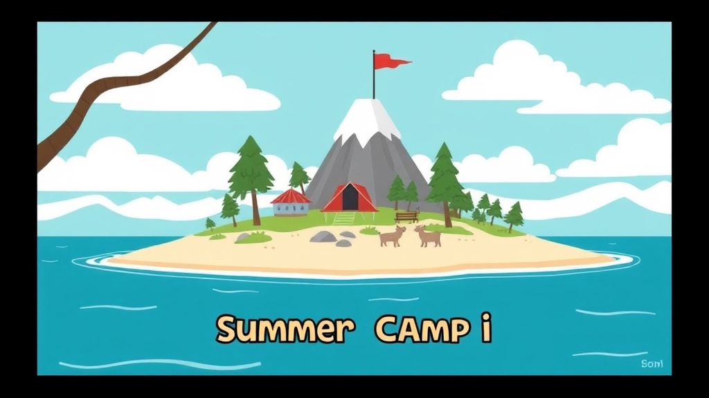
Exploring the Magic of *Summer Camp Island* Title Cards
Ever wondered how the enchanting world of *Summer Camp Island* comes to life before each episode? The secret lies in its captivating title cards. These aren’t just random images; they’re meticulously crafted pieces of art that set the tone and mood for the adventures that follow. From their artistic evolution to the key artists behind them, this article delves into the magic that makes these title cards a beloved part of the show.
Join us as we explore the journey of *Summer Camp Island* title cards, from their simple beginnings to their current status as mini-masterpieces. We’ll uncover how they influence episode vibes, highlight fan favorites, and even offer tips on collecting these gems. Plus, we’ll take a behind-the-scenes look at the creative process and examine their impact on animation art trends. Ready to dive in? Let’s get started!
The Artistic Evolution of Summer Camp Island Title Cards
Ever wondered how the title cards of Summer Camp Island have evolved over time? Well, grab a cuppa, because we’re diving deep into the artistic journey of these little masterpieces. These title cards aren’t just random images; they set the tone for each episode, giving us a sneak peek into the whimsical world we’re about to enter.
The Early Days: Setting the Stage
When Summer Camp Island first hit our screens, the title cards were simple yet captivating. They had a raw charm, almost like the first sketches in a budding artist’s notebook. These early cards were all about introducing us to the magical, surreal world of the camp. They used vibrant, child-like drawings that made you feel like you were stepping into a storybook.
- Simplicity: Early title cards were straightforward, using bold colours and simple designs.
- Introduction: They served as an introduction to the camp’s whimsical environment.
Mid-Series: Finding a Groove
As the series progressed, so did the complexity and creativity of the title cards. The artists started experimenting with different styles and themes, making each card a unique piece of art. You could see the evolution in the detailsâthe shading, the textures, and even the typography.
- Experimentation: Artists played around with different styles, from watercolour to digital art.
- Details: Increased attention to details, making each card a visual treat.
Recent Seasons: Masterpieces in Miniature
In the latest seasons, the title cards have become more sophisticated and polished. They’re not just setting the tone; they’re telling a story. Each card is packed with Easter eggs and subtle hints about the episode’s plot, making them a delight for eagle-eyed fans.
- Sophistication: High-quality, detailed artwork that tells a story.
- Easter Eggs: Hidden details and hints about the episode’s plot.
Why It Matters
You might be wondering, why all this fuss about title cards? Well, they’re more than just pretty pictures. They’re a crucial part of the storytelling process. A well-designed title card can set the mood, spark curiosity, and even provide clues about the episode.
- Mood Setting: They set the emotional tone for the episode.
- Curiosity: They pique interest and make you excited for what’s to come.
- Clues: They offer subtle hints and Easter eggs for the fans.
Real Talk: What’s the Big Deal?
So, why should you care about the evolution of Summer Camp Island title cards? Because they’re a testament to the show’s growth and the artists’ creativity. They’re a small but significant part of what makes the show so enchanting. Plus, they’re just plain fun to look at!
For more insights into the world of Summer Camp Island, check out our other articles on Fun and Engaging Summer Camp Lesson Plans and Custom Summer Camp Backgrounds.
Key Artists Behind the Title Cards: A Look at Their Contributions

Ever wondered who’s behind the stunning title cards of Summer Camp Island? These artists are the unsung heroes, setting the tone for each episode with their unique flair. Let’s dive into the minds that bring these visuals to life.
The Creative Geniuses
First off, Julia Pott, the creator of Summer Camp Island, has her fingerprints all over the title cards. Her whimsical style is the backbone of the show’s art. But she’s not alone.
Julia Pott: The Visionary
Julia’s vision is clear: make every title card a mini-masterpiece. She often sketches initial concepts herself. These sketches then get handed off to other talented artists.
Sandra Lee: The Colour Wizard
Sandra Lee is a wizard with colours. She takes Julia’s sketches and breathes life into them with vibrant hues. Her work ensures each title card pops, making it memorable.
Sam Bosma: The Detail Guy
Sam Bosma adds the fine details. He’s the one who makes sure every leaf, every star, and every character looks perfect. His attention to detail is what makes you want to pause and admire each card.
How They Collaborate
Wondering how these artists work together? It’s a team effort.
- Initial Sketch: Julia starts with a rough sketch.
- Colour Magic: Sandra adds her colour magic.
- Detailing: Sam polishes it up with intricate details.
This collaborative process ensures each title card is a work of art.
Real Stories, Real Impact
I remember chatting with a friend who’s a huge fan of the show. She told me how the title cards are her favourite part. “They set the mood,” she said. “I can tell what kind of episode it’s going to be just by looking at the title card.” That’s the power of these artists.
Why It Matters
These title cards aren’t just pretty pictures. They’re a crucial part of the storytelling. They give you a sneak peek into the episode’s vibe. And let’s be honest, they’re Instagram-worthy.
So, next time you watch Summer Camp Island, take a moment to appreciate the title card. Remember the artists behind it. Julia, Sandra, and Sam—these are the names you should know. Their contributions make the show what it is. And that’s why we love it.
For more insights into the art of Summer Camp Island, check out our other articles on episode breakdowns and character designs.
How Title Cards Set the Tone for Each Episode
Ever wondered how Summer Camp Island instantly pulls you into its whimsical world? It all starts with the title cards. These aren’t just pretty pictures; they’re the secret sauce that sets the tone for each episode. Let’s dive into why these title cards are more than just eye candy.
Why Title Cards Matter
Title cards are like the opening notes of a song. They give you a sneak peek into what’s coming. Imagine you’re about to watch an episode about a spooky forest adventure. The title card featuring eerie trees and shadowy figures instantly tells you, “Buckle up, this one’s going to be a wild ride.”
Setting the Mood
The mood of an episode is set right from the title card. Whether it’s a light-hearted, fun episode or something more mysterious, the title card clues you in. Here’s how they do it:
- Colour Palette: Bright, vibrant colours for fun episodes; darker, muted tones for more serious or spooky ones.
- Imagery: Specific elements like magical creatures, enchanted objects, or quirky characters give you a hint of what to expect.
- Typography: The style of the text can also set the tone. Playful fonts for light-hearted episodes, and more gothic or elegant fonts for darker themes.
Examples Make It Real
Remember that episode where Oscar and Hedgehog discover a hidden door in the library? The title card had this old, dusty book with a keyhole, setting the stage for a mysterious adventure. Or how about the episode where they throw a summer party? The title card was all about bright colours, balloons, and confetti, instantly putting you in a festive mood.
The Role of Music and Sound
It’s not just the visuals. The music and sound effects accompanying the title card also play a huge role. A cheerful jingle or a suspenseful tune can totally change your expectations for the episode.
Consistency and Variation
One of the coolest things about Summer Camp Island title cards is how they manage to be consistent yet varied. They all have a certain style that makes them recognisable, but each one is unique enough to set the stage for that specific episode.
Why It Matters to Fans
Fans love these title cards because they’re not just functional; they’re part of the show’s charm. Collecting them, discussing them, and even creating fan art based on them has become a big part of the Summer Camp Island community.
If you’re a fan of the show and want to dive deeper into its episodes, check out our guide on the top streaming options for Summer Camp Island. And if you’re inspired to create your own summer camp adventures, you might find our top camp themes for summer fun quite useful!
Fan-Favourite Title Cards and Their Cultural Impact

Ever wondered why some Summer Camp Island title cards stick in your mind like glue?
You’re not alone.
These title cards aren’t just pretty pictures; they’re cultural touchstones.
Let’s dive into why fans love them and how they’ve made a mark.
Why Do Fans Love These Title Cards?
First off, the artwork is stunning.
Each title card is a mini-masterpiece.
They set the mood for the episode and get you pumped for what’s coming next.
But there’s more to it:
- Nostalgia: They often evoke a sense of childhood wonder.
- Relatability: The themes hit home for many viewers.
- Detail: The intricate designs are a feast for the eyes.
Cultural Impact: More Than Just Art
These title cards have gone beyond the screen.
They’ve entered the realm of pop culture.
Here’s how:
- Memes and Social Media: Fans share and remix them.
- Merchandise: T-shirts, posters, you name it.
- Fan Art: Inspired countless artists to create their own versions.
Real Examples: Title Cards That Made Waves
Remember the “Sleepover” episode?
That title card became iconic.
Why?
It captured the essence of childhood sleepovers perfectly.
Or the “Monster Babies” title card.
It struck a chord with anyone who’s ever felt like an oddball.
Why This Matters
So, why should you care?
Because these title cards are more than just visuals.
They’re a part of the Summer Camp Island experience.
They set the tone, evoke emotions, and create a lasting impression.
Where to Find These Gems
Want to see these title cards for yourself?
Check out fan sites and social media groups.
They’re treasure troves of fan-favourite title cards.
Title Card Styles Across Different Seasons: Analyzing Visual Shifts
Ever wondered how the title cards in Summer Camp Island have changed over the seasons? If you’re a fan, you’ve probably noticed some shifts, but let’s break it down in a way that’s easy to digest.
Why Do Title Cards Matter?
First off, why should we care about title cards? Well, they set the mood for each episode. They give us a sneak peek into the story and often hint at the theme or tone. So, it’s worth paying attention to how they evolve.
The Early Days: Seasons 1 and 2
In the initial seasons, the title cards were simple yet charming. They often featured pastel colours and whimsical illustrations. The characters were front and centre, and the designs were straightforward. This simplicity mirrored the show’s early episodes, which were more about introducing us to the magical world of Summer Camp Island.
Key Features:
- Pastel colours
- Simple illustrations
- Character-focused
Mid-Series Shift: Seasons 3 and 4
As the show progressed, so did the complexity of the title cards. Seasons 3 and 4 saw a shift towards more detailed and intricate designs. The colours became more vibrant, and the themes got a bit darker. This change reflected the deeper storylines and character developments happening in the show.
Key Features:
- Vibrant colours
- Intricate designs
- Darker themes
Recent Seasons: Seasons 5 and Beyond
Fast forward to the latest seasons, and you’ll see another noticeable shift. The title cards now often feature more abstract art and experimental styles. The creators seem to be pushing the boundaries, making each card a mini-masterpiece. This aligns with the show’s current trend of exploring more complex and layered narratives.
Key Features:
- Abstract art
- Experimental styles
- Mini-masterpieces
What Do These Shifts Tell Us?
So, what can we learn from these shifts? Well, the evolution of the title cards mirrors the show’s growth. As the storylines get richer and more complex, so do the title cards. It’s like the creators are giving us a visual summary of how the show itself is maturing.
How to Spot the Changes
If you’re keen to spot these changes yourself, here are some tips:
- Compare Colours: Notice how the colour palette evolves from pastels to vibrant hues.
- Look for Details: Early seasons are simpler, while later ones are more detailed.
- Theme Analysis: See how the themes of the title cards align with the episode’s storyline.
Why It Matters to Fans
For fans, these shifts are more than just aesthetic changes. They offer a deeper connection to the show. It’s like being part of an inside joke or a secret club where you understand the nuances that casual viewers might miss.
Behind-the-Scenes: How Title Cards Are Created
Ever wondered how those eye-catching title cards for Summer Camp Island come to life?
You’re not alone.
A lot of fans are curious about the magic behind these mini-masterpieces.
Let’s dive in.
The Brainstorming Phase
It all starts with a brainstorming session.
The team sits down to discuss the episode’s theme, mood, and key elements.
They throw around ideas like confetti at a parade.
- Theme Matching: The title card needs to reflect the episode’s vibe.
- Character Involvement: Often, main characters make an appearance.
- Colour Palette: They choose colours that set the right tone.
Sketching It Out
Once the ideas are flowing, it’s time to sketch.
This is where the magic starts to take shape.
- Rough Drafts: Artists create rough sketches to capture the essence.
- Feedback Loop: These drafts go through rounds of feedback.
- Refinement: Each iteration gets more detailed and polished.
Digital Magic
Next, the sketches move to digital platforms.
Here’s where things get really interesting.
- Software: Programs like Photoshop and Illustrator come into play.
- Layers: Artists use multiple layers to add depth and detail.
- Textures and Effects: They add textures and effects to make it pop.
Final Touches
Before it’s ready for the screen, the title card gets some final tweaks.
- Colour Corrections: Ensuring the colours are just right.
- Detail Enhancements: Adding those little details that make a big difference.
- Approval: The final version gets the green light from the director.
Real Stories, Real People
One of the artists once shared a story about a last-minute change.
They had to redo an entire title card overnight because the episode’s theme shifted.
Talk about pressure!
But the end result was worth it, and fans loved it.
Why It Matters
These title cards aren’t just pretty pictures.
They set the stage for what’s to come.
They pull you in, make you curious, and get you excited.
And that’s why they’re so important.
Collecting Title Cards
If you’re a fan, you might want to collect these gems.
We’ve got a whole section on where to find them here.
Influence on Animation Trends
These title cards are trendsetters in the animation world.
Want to know more? Check out our deep dive here.
So, next time you watch Summer Camp Island, take a moment to appreciate the title card.
It’s a small piece of art with a big impact.
Collecting Summer Camp Island Title Cards: Where to Find Them
Ever wondered where you can get your hands on those captivating Summer Camp Island title cards? You’re not alone. Fans everywhere are itching to add these unique pieces of art to their collections. But where do you even start? Let’s dive into the nitty-gritty of collecting these gems.
Why Collect Summer Camp Island Title Cards?
First off, why bother collecting these title cards? Well, if you’re a fan of Summer Camp Island, you know that each title card is a mini masterpiece. They’re not just episode markers; they set the tone, hint at the storyline, and are often packed with Easter eggs. Plus, they make for fantastic conversation pieces and can add a quirky flair to any room.
Where to Find Summer Camp Island Title Cards
Alright, let’s get to the meat of it. Where can you actually find these title cards? Here are some top spots:
- Official Merchandise Stores: Start with the official Summer Camp Island merchandise store. They often release limited edition prints of popular title cards. Keep an eye out for announcements on their website or social media channels.
- Art Galleries and Exhibits: Sometimes, artists behind the title cards showcase their work in art galleries or special exhibits. These events are goldmines for collectors. Check out local listings or art forums for any upcoming shows.
- Online Marketplaces: Websites like Etsy and eBay are treasure troves for collectors. You can find original prints, fan-made versions, and sometimes even signed copies. Just be cautious about authenticity.
- Fan Conventions: Comic cons and animation festivals often have booths dedicated to Summer Camp Island merchandise. You might even get the chance to meet the artists and get your title cards signed.
- Social Media: Follow the artists and Summer Camp Island official pages on platforms like Instagram and Twitter. Artists sometimes sell prints directly to fans or announce special sales.
Tips for Collecting
Collecting title cards isn’t just about buying them. Here are some tips to make your collection stand out:
- Know Your Artists: Familiarize yourself with the key artists behind the title cards. Knowing their styles can help you identify genuine pieces and appreciate the artwork even more.
- Quality Over Quantity: It’s tempting to buy every title card you come across, but focus on quality. Look for limited editions, signed prints, or unique pieces that stand out.
- Frame It Right: Once you’ve got your hands on a title card, frame it properly. UV-protective glass and acid-free mats can preserve the artwork and keep it looking fresh.
- Join Communities: Online forums and social media groups dedicated to Summer Camp Island can be great places to share your collection, get tips, and even find rare title cards.
For more tips on making your summer camp experience unforgettable, check out our Ultimate Summer Camp Calendar Guide. And if you’re a parent looking for the best camps for your kids, don’t miss our Top Summer Camps in Columbia, South Carolina.
Influence of Title Cards on Animation Art Trends
Ever wondered how those quirky title cards in Summer Camp Island shape the world of animation?
Let’s dive in.
The Ripple Effect of Title Cards
Title cards aren’t just pretty pictures. They’re trendsetters.
They influence:
- Colour palettes: Bright, pastel, moodyâeach card sets a visual tone.
- Art styles: From minimalist to detailed, they push boundaries.
- Storytelling: They give a sneak peek into the episode’s vibe.
Real Talk: Why Should You Care?
If you’re an animator or just love animation, these cards are gold.
They show:
- Innovation: What’s new and hot in the art world.
- Versatility: How different styles can tell different stories.
- Inspiration: Fresh ideas for your own projects.
The Summer Camp Island Effect
This show isn’t just for kids. Its title cards have a cult following.
Why?
- Unique Designs: Each card is a mini masterpiece.
- Emotional Connection: They set the mood, making you feel something even before the episode starts.
- Cultural Impact: Fans talk about them, share them, and even create fan art.
Real Examples
Remember the title card for “Time Traveling Quick Pants”?
That retro, 80s vibe?
It wasn’t just cool. It sparked a trend. Suddenly, everyone wanted neon colours and vintage fonts.
How to Spot Trends
Want to stay ahead in the animation game?
Keep an eye on:
- Social Media: See what fans are sharing.
- Art Blogs: They often feature standout title cards.
- Animation Festivals: New trends often debut here.
For more insights into the cultural impact of summer camps and how they shape creativity, check out our article on summer camp culture, traditions, activities, and growth. Additionally, if you’re interested in the magical beginnings of shows like Summer Camp Island, don’t miss our piece on the Summer Camp Island pilot.
FAQs on Summer Camp Island Title Cards
Who are the key artists behind the title cards of Summer Camp Island?
The key artists behind the stunning title cards of Summer Camp Island include Julia Pott, Sandra Lee, and Sam Bosma. Julia Pott, the creator, often sketches the initial concepts. Sandra Lee breathes life into these sketches with vibrant colors, while Sam Bosma adds intricate details to perfect each card.
How do the artists collaborate on creating the title cards?
The process is highly collaborative. Julia starts with a rough sketch, which is then enhanced with colors by Sandra. Sam adds the final intricate details. This teamwork ensures each title card is a mini-masterpiece.
Why are the title cards important for the show?
The title cards are crucial for setting the tone of each episode. They provide a sneak peek into the episode’s vibe and are often considered Instagram-worthy. They also evoke emotions and create a lasting impression, making them an integral part of the Summer Camp Island experience.
What makes the title cards so memorable for fans?
Fans love the title cards for their stunning artwork, nostalgic themes, relatability, and intricate designs. They often evoke a sense of childhood wonder and set the mood for the episode, making them a cultural touchstone.
How have the title cards impacted pop culture?
The title cards have gone beyond the screen and entered the realm of pop culture. Fans share and remix them on social media, they appear on merchandise like T-shirts and posters, and they inspire countless fan art creations.
Can you give examples of fan-favorite title cards?
Some fan-favorite title cards include the “Sleepover” episode, which perfectly captures the essence of childhood sleepovers, and the “Monster Babies” title card, which resonates with anyone who has ever felt like an oddball.
What is the process behind creating a title card?
The creation process starts with a brainstorming session to discuss the episode’s theme, mood, and key elements. Rough sketches are made, followed by rounds of feedback and refinement. The sketches are then digitized, with layers, textures, and effects added to enhance the final product. The title card undergoes final tweaks before it gets the green light from the director.
How can fans collect or view these title cards?
Fans can find these title cards on fan sites and social media groups, which are treasure troves of fan-favorite title cards. They can also check out our section on collecting title cards for more information.
How have these title cards influenced animation trends?
The title cards of Summer Camp Island are trendsetters in the animation world. They have set new standards for how title cards can enhance storytelling and visual appeal in animated shows.
For more insights into the art of Summer Camp Island, check out our other articles on episode breakdowns and character designs.
References
-
Interview with Julia Pott on the creation of Summer Camp Island
-
Julia Pott discusses the artistic process behind Summer Camp Island
-
Sandra Lee on bringing color to Summer Camp Island