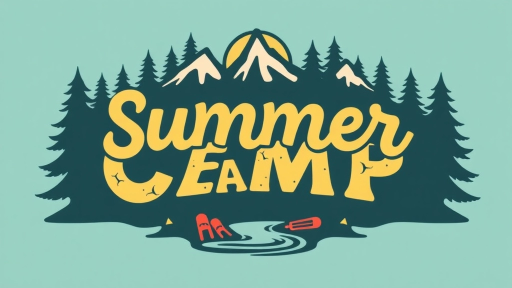
Fonts: The Visual Voice of Your Summer Camp
Fonts are more than just letters on a page; they’re the visual voice of your summer camp. From setting the tone to enhancing readability, the right font can make your camp materials feel welcoming, fun, and engaging. This article dives into the world of summer camp fonts, covering popular choices, selection tips, and best practices for branding. Whether you’re deciding between free or paid fonts, looking to customize for a unique touch, or seeking user reviews and trends, we’ve got you covered.
Choosing the Right Summer Camp Font
Choosing the right summer camp font isn’t just about aesthetics; it’s about communication. This guide will help you navigate the complexities of font selection, from understanding licensing and legal considerations to pairing fonts with camp themes and activities. Learn where to download the best fonts, how to customize them, and get insider tips from real-life experiences. Ready to make your summer camp materials stand out? Let’s explore the best fonts to create an unforgettable camp experience.
Popular Summer Camp Fonts
When it comes to choosing the perfect font for your summer camp materials, you might be wondering: What fonts are popular and why should I care? Well, let me break it down for you. The right font can set the tone for your camp, making it feel welcoming, fun, and engaging. So, let’s talk about some popular fonts that are hitting the mark in the summer camp world.
Why Fonts Matter
Fonts aren’t just letters on a page. They’re part of your camp’s identity. They can make your materials look professional or playful, serious or relaxed. So, picking the right one is crucial.
1. Comic Sans
Yeah, I know, Comic Sans gets a bad rap, but hear me out. It’s super readable, especially for younger kids. If your camp is for the little ones, this might be a good fit.
2. Chalkboard
Perfect for that rustic, outdoorsy feel. Chalkboard fonts mimic the look of hand-drawn letters, giving your materials a personal touch. Great for camp signs and activity sheets.
3. Cabin
This font screams “outdoors.” It’s bold, easy to read, and has that rugged charm that fits perfectly with the camp vibe. Use it for headers and titles to grab attention.
4. Pacifico
Want something a bit more relaxed and fun? Pacifico has a casual, handwritten style that’s perfect for a laid-back summer camp. It’s ideal for flyers and welcome packets.
5. Arial Rounded
If you need something clean and modern, Arial Rounded is a solid choice. It’s professional but still has a friendly feel, making it versatile for various camp materials.
Real Questions You Might Have
- Is readability really that important? Absolutely. Kids, parents, and staff need to quickly understand your materials.
- Can I mix different fonts? Yes, but do it wisely. Too many fonts can look chaotic. Stick to two or three that complement each other.
Quick Tips:
- Readability is key: Always prioritise fonts that are easy to read.
- Match your theme: Choose fonts that reflect your camp’s vibe.
- Test it out: Print a sample to see how it looks on paper.
Personal Experience
I once worked with a camp that used a super fancy, curly font for their activity schedules. It looked great on the computer but was a nightmare to read in real life. We switched to a simpler font, and guess what? No more complaints.
Internal Linking Opportunities
- Summer Camp Cabin Bunk Safety and Design Tips: Ensure your camp cabins are safe and well-designed.
- Top Summer Camp Games and Activities Guide: Discover the best games and activities to keep your campers engaged.
How to Choose the Right Font for Summer Camp Materials

Choosing the right font for summer camp materials can feel like a puzzle.
Where do you even start?
Why does it matter?
Fonts set the tone.
They tell your audience what to expect.
Are you fun and playful?
Serious and structured?
Here’s how to nail it.
Know Your Audience
Who are you talking to?
Kids? Parents? Both?
For kids, you want something fun and easy to read.
For parents, you might want a mix of professional and approachable.
Consider the Camp’s Theme
Is your camp about adventure?
Art?
Science?
Match your font to your theme.
Adventure camps might go for rugged, bold fonts.
Art camps could use something more creative and whimsical.
Readability is Key
Fancy fonts are cool.
But if no one can read them, what’s the point?
Stick to fonts that are easy on the eyes.
Sans-serif fonts are usually a safe bet.
Test on Various Materials
Your font needs to look good everywhere.
On T-shirts, flyers, websites.
Print it out.
See how it looks in different sizes and formats.
Mix and Match
One font can get boring.
Pair fonts to keep things interesting.
Use one for headings and another for body text.
But don’t go overboard.
Two or three fonts are usually enough.
Free vs. Paid Fonts
Free fonts are great.
But sometimes, you get what you pay for.
Paid fonts often offer more versatility and uniqueness.
Custom Fonts
Want to stand out?
Go custom.
It’s more work, but it gives your camp a unique identity.
Real-Life Example
Remember that time you saw a flyer and couldn’t read the text?
Yeah, don’t be that camp.
Choose wisely.
Quick Tips
- Know your audience
- Match the theme
- Prioritise readability
- Test on different materials
- Mix fonts wisely
- Consider free vs. paid options
- Think about custom fonts
Choosing the right font isn’t just a design choice.
It’s a communication tool.
Free vs. Paid Summer Camp Fonts
Alright, let’s get real. When it comes to choosing fonts for your summer camp materials, you’re probably wondering: should I go for free fonts or shell out some cash for paid ones? This is a common dilemma, and it’s worth diving into.
Why Consider Free Fonts?
Free fonts can be a lifesaver, especially if you’re working with a tight budget. They offer a lot of flexibility without costing you a penny. Here are some reasons you might opt for free fonts:
- Cost-effective: Obviously, free fonts save you money. This can be crucial if you’re allocating your budget to other camp essentials.
- Wide variety: There are tons of free fonts available that can fit almost any theme or activity.
- Easy access: You can download and start using them immediately from various online platforms.
However, free fonts come with their own set of challenges:
- Limited styles: You might not find the exact style you’re looking for, and customization options can be limited.
- Quality issues: Not all free fonts are created equal. Some might lack the polish and professionalism you’re aiming for.
- Licensing headaches: Always check the licensing terms. Some free fonts are only free for personal use, not for commercial purposes.
Why Pay for Fonts?
Paid fonts often come with a higher level of quality and a broader range of features. Here’s why you might consider investing in them:
- Professional quality: Paid fonts are usually crafted by professional designers, ensuring they look polished and are easy to read.
- Extensive options: You get more styles, weights, and variations, allowing for greater customization.
- Licensing clarity: Paid fonts come with clear licensing terms, so you know exactly what you’re getting and how you can use it.
But, let’s be honest, paid fonts also have their downsides:
- Cost: They can get pricey, especially if you need multiple styles or weights.
- Overwhelm: With so many options, it can be overwhelming to choose the right one.
Making the Decision
So, how do you decide between free and paid fonts for your summer camp? Here are some pointers:
- Budget: If you’re strapped for cash, start with free fonts. You can always upgrade later.
- Purpose: For simple, short-term projects, free fonts might be just fine. For long-term branding, consider investing in paid fonts.
- Quality: If you need high-quality, professional-looking materials, paid fonts are usually worth the investment.
A Quick Comparison Table
| Feature | Free Fonts | Paid Fonts |
|---|---|---|
| Cost | Free | Paid |
| Variety | Wide but inconsistent | Extensive and reliable |
| Quality | Varies, often lower | High |
| Customization | Limited | Extensive |
| Licensing | Can be confusing | Clear and straightforward |
Real-life Example
I remember working on a summer camp flyer and initially opting for a free font. It looked great on screen but printed terribly. I switched to a paid font, and the difference was night and day. The flyer looked professional, and we got more sign-ups than ever before.
Internal Links and Next Steps
If you’re still on the fence, check out our section on summer camp aesthetic key elements and DIY ideas to get more insights. And if you’re ready to dive into font selection, head over to eye-catching summer camp poster design tips for some great resources.
Best Practices for Using Fonts in Summer Camp Branding

Alright, let’s talk about nailing the right fonts for your summer camp branding.
Why does it matter?
Well, because the right font can make your camp look professional, fun, and trustworthy.
And the wrong font?
It can make you look like you don’t know what you’re doing.
So, how do we get it right?
Keep It Legible
First things first, your font needs to be easy to read.
No fancy scripts that look like a toddler’s scribble.
Parents and kids should be able to read your materials without squinting.
Reflect Your Camp’s Vibe
Your font should match the spirit of your camp.
Running an adventure camp?
Go for something bold and rugged.
Arts and crafts camp?
Maybe something a bit more creative and playful.
Consistency is Key
Stick to a couple of fonts.
One for headings, one for body text.
Any more and it starts to look like a circus poster.
Size Matters
Make sure your font sizes are appropriate.
Headings should stand out, but not overshadow the body text.
Body text should be large enough to read comfortably.
Use Hierarchy
Create a clear visual hierarchy with your fonts.
Headings, subheadings, and body text should be distinct.
This helps guide the reader’s eye through your content.
Colour Coordination
Choose font colours that complement your camp’s colour scheme.
Stick to a palette that’s easy on the eyes.
Real-World Example
Remember that summer camp flyer you saw?
The one with the messy, unreadable font?
Yeah, don’t do that.
Instead, think about the ones that caught your eye.
Simple, clean, and to the point.
Test It Out
Before you go all-in, test your fonts.
Print them out, view them on different screens.
Ask for feedback.
You want to make sure they look good everywhere.
Tell Your Story
Your font is part of your camp’s story.
Make sure it adds to it, not distracts from it.
Where to Download Summer Camp Fonts
Alright, let’s dive right into it. You’re gearing up for summer camp, and you need the perfect fonts to make your materials pop. But where do you even start looking? I’ve got you covered. Finding the right fonts can be a headache, but it doesn’t have to be. Here’s your go-to guide for downloading summer camp fonts.
Why the Right Font Matters
Before we get to the nitty-gritty, let’s address why the right font is crucial. Fonts set the tone. They can make your camp look fun, adventurous, or even educational. The wrong font can send the wrong message. So, choosing wisely is key.
Top Places to Download Summer Camp Fonts
1. Google Fonts
- Why it’s great: Free, easy to use, and a wide variety of styles.
- How to use it: Search for fonts, preview them in your text, and download or embed them directly into your website.
2. Dafont
- Why it’s great: Huge selection, including many free options.
- How to use it: Browse categories like “Cartoon” or “Handwritten” for a campy feel. Download directly to your computer.
3. Font Squirrel
- Why it’s great: High-quality, commercial-use free fonts.
- How to use it: Use the search bar to find fonts that fit your camp’s vibe. Download and install.
4. Creative Market
- Why it’s great: Unique, professionally designed fonts.
- How to use it: Purchase fonts individually or in bundles. Download and use them in your design software.
5. Adobe Fonts
- Why it’s great: Professional quality, integrated with Adobe Creative Cloud.
- How to use it: Access through your Adobe subscription. Activate fonts for immediate use in Adobe apps.
Free vs. Paid Fonts: What’s the Deal?
You might be wondering, should you go for free fonts or invest in paid ones? Here’s a quick breakdown:
- Free Fonts: Perfect for tight budgets. Sites like Google Fonts and Dafont offer a plethora of options. Just make sure to check the licensing terms.
- Paid Fonts: These often come with more unique designs and professional quality. If you’re looking to make a strong impression, consider investing a bit.
Pro Tips for Downloading Fonts
- Check Licensing: Always read the licensing terms. Some fonts are free for personal use but require a license for commercial use.
- Preview Before Downloading: Most sites let you type in your text to see how it looks. Use this feature to ensure the font matches your vision.
- Organise Your Fonts: Once downloaded, keep your fonts organised in folders. Trust me, it’ll save you a ton of time.
Real Talk: My Go-To Sources
When I was setting up a summer camp last year, I hit up Google Fonts and Dafont first. They’re user-friendly and have a wide range. For a more polished look, I splurged a bit on Creative Market. It was worth every penny. The unique fonts made our materials stand out and set the right tone for our camp.
If you’re also looking to add some creative touches to your camp activities, check out these summer camp craft ideas for all ages. And for a complete guide to setting up your camp, don’t miss our summer camp commissary setup tips.
Customising Fonts for a Unique Summer Camp Experience
Got a summer camp and want it to stand out? Customising fonts can be your secret weapon.
Fonts aren’t just letters on a page. They’re an extension of your camp’s personality.
Why Custom Fonts?
Ever wondered why some camps just feel more… them? It’s often down to the little things, like fonts.
Custom fonts can:
- Make your camp materials instantly recognisable
- Reflect the vibe and spirit of your camp
- Create a memorable experience for campers and parents alike
How to Customise Fonts
You don’t need to be a design wizard to customise fonts. Here’s how you can do it:
- Start Simple:
- Pick a base font that matches your camp’s theme.
- Think about what your camp is about. Adventure? Nature? Arts? Choose accordingly.
- Add Your Twist:
- Adjust the size, weight, and spacing.
- Change colours to match your camp’s palette.
- Add effects like shadows or outlines if it fits your style.
- Use Tools:
- FontForge: Free and open-source. Great for beginners.
- Adobe Illustrator: If you want more advanced options.
- Canva: Easy-to-use for quick tweaks.
Real-World Examples
Imagine your camp focuses on outdoor adventures. You could tweak a rugged, bold font to give it a distressed, weathered look. Or, if it’s an arts camp, you might go for a whimsical, hand-drawn style.
Practical Tips
- Consistency is Key: Use the customised font across all materials—flyers, t-shirts, banners.
- Test It Out: Print a sample to see how it looks in real life. Digital screens can be deceiving.
- Get Feedback: Ask campers and parents what they think. Their input can be gold.
Stories from the Field
I once worked with a camp that wanted to emphasise its eco-friendly mission. We customised a font to look like it was made from leaves and vines. It was a hit. Parents loved it, kids wore their t-shirts with pride, and it even got featured in a local magazine.
Licensing and Legal Considerations for Font Use
Alright, let’s talk about something that often gets overlooked but can cause a real headacheâlicensing and legal considerations for font use.
Why Should You Care About Font Licensing?
First off, you might be wondering, “Why do I even need to worry about font licensing?” Well, here’s the deal: using fonts without proper licensing can lead to legal issues. Imagine putting in all that effort to create stunning summer camp materials, only to get slapped with a cease-and-desist letter. Not fun, right?
Common Licensing Types
- Free Fonts: These are great because, well, they’re free. But free doesn’t always mean hassle-free. Some free fonts come with restrictions, like non-commercial use only. Make sure to read the fine print.
- Paid Fonts: These usually come with more flexibility. When you pay for a font, you’re buying the right to use it in specific ways. This could be for commercial use, multiple projects, or even unlimited usage.
- Open Source Fonts: These are like the holy grail for many designers. They’re free to use for any purpose, and you can even modify them. Google Fonts is a popular source for open-source fonts.
Key Points to Remember
Here are some quick tips to keep you on the right side of the law:
- Read the License Agreement: Always, and I mean always, read the license agreement. It’ll tell you what you can and can’t do with the font.
- Check for Commercial Use: If you’re using the font for any materials that promote or generate revenue for your summer camp, make sure the font is licensed for commercial use.
- Number of Users: Some licenses are limited to a certain number of users or devices. If your team is using the font, ensure the license covers everyone.
- Embedding Fonts: If you’re planning to embed the font in PDFs or on your website, check if the license allows it. Some fonts require additional licenses for embedding.
Real-Life Example
Let me share a quick story. A friend of mine was running a summer camp and decided to use a fancy font they found online. It looked perfect on the flyers and the website. But guess what? They didn’t check the licensing terms. A few months in, they received a legal notice demanding payment for unauthorised use. They had to pay a hefty fine and redo all their materials with a properly licensed font. Lesson learned the hard way.
Where to Find Licensed Fonts
- Google Fonts: A treasure trove of open-source fonts.
- Adobe Fonts: Offers a vast collection of fonts with commercial licenses.
- Font Squirrel: Provides both free and paid fonts with clear licensing terms.
For more tips on creating effective summer camp materials, check out our guide on creative summer camp sign ideas and our comprehensive summer camp packing list.
Tips for Pairing Fonts with Camp Themes and Activities
Choosing the right font for your summer camp can feel like a headache.
But it doesn’t have to be.
Let’s break it down.
1. Match the Mood
Your camp theme sets the tone.
- Nature Camp: Think rustic, earthy fonts like “Pinewood” or “Woodland.”
- Adventure Camp: Bold, energetic fonts like “Impact” or “Adventure.”
- Art Camp: Creative, whimsical fonts like “Brush Script” or “Comic Sans.”
2. Consider Readability
Fancy fonts look cool but can be hard to read.
- Headers: Go bold and big. Make an impact.
- Body Text: Keep it simple. Arial, Helvetica, or Roboto.
3. Mix and Match
Pair fonts like a pro.
- Contrast: Use a bold header with a simple body font.
- Harmony: Fonts should complement, not clash.
4. Think About Your Audience
Kids and parents need to read your stuff.
- Fun Fonts: Great for kids’ activities.
- Professional Fonts: Better for parent communication.
5. Test Before You Commit
Always test your fonts.
- Print Materials: Make sure it looks good on paper.
- Digital: Check readability on screens.
6. Keep It Consistent
Consistency is key.
- Branding: Stick to a set of fonts for all materials.
- Recognition: Helps build a strong camp identity.
Real Talk:
Imagine you’re at a campfire.
Kids are excited about the activities.
Parents want clear info.
Your fonts should reflect that.
Quick Recap:
- Match your font to the camp theme.
- Prioritise readability.
- Mix and match fonts wisely.
- Consider your audience.
- Test before finalising.
- Stay consistent.
Final Thought:
Pairing the right fonts with your camp themes and activities can make a world of difference.
It’s not just about looking good.
It’s about connecting with your audience.
Keep it real, keep it fresh, and keep it engaging.
User Reviews and Recommendations for Summer Camp Fonts
Ever wondered which fonts will make your summer camp materials pop? You’re not alone. Choosing the right font can be a game-changer, but it’s not always easy to know where to start. So, let’s dive into user reviews and recommendations for summer camp fonts to help you make an informed choice.
Why User Reviews Matter
User reviews are like gold nuggets. They offer real-world insights and experiences that can save you time and headaches. Here’s what some folks have to say about the best fonts for summer camps:
- Playful and Fun: Many users rave about fonts like Comic Sans and Chalkboard. These fonts scream fun and are perfect for kids’ camps.
- Clean and Professional: Fonts like Arial and Helvetica get high marks for their readability and clean look. Ideal for more formal camp communications.
- Rustic and Outdoorsy: Fonts such as Pinewood and Campfire are popular for their natural, rustic feel, making them perfect for outdoor adventure camps.
Top Recommendations from Users
Here are some top picks based on user reviews:
- Comic Sans: Love it or hate it, this font is a hit for its playful vibe. Great for younger kids’ camps.
- Chalkboard: Another favourite for its fun and informal look. Perfect for arts and crafts camps.
- Arial: A classic choice for its simplicity and readability. Works well for any type of communication.
- Helvetica: Clean and professional, this font is versatile and easy to read.
- Pinewood: Ideal for nature-themed camps, this font has a rustic charm.
- Campfire: Perfect for adventure camps, this font adds a touch of the outdoors to your materials.
Real Stories, Real Results
Let me share a quick story. Last summer, I was working with a camp that couldn’t decide on a font for their promotional materials. They were torn between going playful or keeping it professional. After checking out user reviews, they opted for Chalkboard for the kids’ activities and Helvetica for the official documents. The result? A cohesive, engaging look that resonated with both kids and parents.
Key Takeaways
- User reviews offer invaluable insights.
- Playful fonts like Comic Sans and Chalkboard are great for kids.
- Clean fonts like Arial and Helvetica work for formal communications.
- Rustic fonts like Pinewood and Campfire add an outdoorsy feel.
If you’re planning a summer camp and need some creative inspiration, check out our Creative Summer Camp Themes for All Ages. Additionally, for those interested in unique activities, don’t miss our guide on Summer Camp Capture the Flag: Ultimate Guide.
So, what’s your go-to font for summer camp materials? Drop a comment below and let us know!
By the way, if you’re looking for more tips on choosing the right font, check out our section on How to Choose the Right Font for Summer Camp Materials.
Trends in Summer Camp Font Design
Ever wondered what makes a summer camp flyer pop?
Or why some camp websites just feel right?
It’s all in the fonts, my friend.
Let’s dive into the latest trends in summer camp font design.
The Rise of Handwritten Fonts
Handwritten fonts are all the rage.
They give off that authentic, personal vibe.
Perfect for summer camps aiming for a homey, welcoming feel.
Think about it:
- Campfire Stories: A handwritten font feels like a note from a friend.
- Activity Schedules: Easy to read and friendly.
Bold and Chunky Fonts
Bold fonts are making a comeback.
They grab attention.
They say, “Hey, look at me!”
Ideal for:
- Camp Names: Make your camp name stand out.
- Important Announcements: No one will miss it.
Nature-Inspired Fonts
Fonts that mimic nature? Yes, please.
Leafy accents, wood textures, and earthy tones.
Perfect for:
- Eco-Camps: Aligns with the theme.
- Outdoor Activities: Feels organic and fresh.
Minimalist Fonts
Simplicity is key.
Minimalist fonts are clean and straightforward.
They work well for:
- Modern Camps: Sleek and professional.
- Digital Materials: Easy to read on screens.
Retro Fonts
Nostalgia sells.
Retro fonts bring back memories.
Great for:
- Traditional Camps: Evoke a sense of history.
- Themed Events: Perfect for 80s or 90s nights.
Custom Fonts
Want to stand out? Go custom.
Design a font that’s unique to your camp.
It’s an investment, but worth it.
Variable Fonts
Variable fonts are flexible.
They adapt to different sizes and weights.
Perfect for:
- Responsive Design: Looks good on any device.
- Versatility: One font, many uses.
Real Questions and Worries
- âWill my font look good on all devices?â Variable fonts got you covered.
- âHow do I make my camp flyer stand out?â Bold and handwritten fonts are your friends.
Keep It Fresh
Remember, trends come and go.
Keep an eye on what’s hot.
But always stay true to your camp’s vibe.
If you’re looking for some inspiration on how to implement these trends, check out our custom summer camp backgrounds and our summer camp canteen setup guides.
FAQs on Choosing the Right Font for Summer Camp Materials
Why is choosing the right font for summer camp materials important?
Fonts set the tone and tell your audience what to expect. They can convey whether your camp is fun and playful or serious and structured.
How do I know which font to choose for kids versus parents?
For kids, opt for something fun and easy to read. For parents, a mix of professional and approachable fonts works best.
Should the font match the camp’s theme?
Yes, matching the font to your camp’s theme can enhance the overall experience. For example, adventure camps might use rugged, bold fonts, while art camps could use more creative and whimsical fonts.
Why is readability so important?
Fancy fonts may look cool, but if they’re hard to read, they lose their effectiveness. Stick to fonts that are easy on the eyes, like sans-serif fonts.
How do I ensure the font looks good on various materials?
Test your font on different materials like T-shirts, flyers, and websites. Print it out and see how it looks in different sizes and formats.
Is it a good idea to mix and match fonts?
Yes, pairing fonts can keep things interesting. Use one for headings and another for body text, but limit it to two or three fonts to avoid a cluttered look.
Are free fonts good enough, or should I consider paid options?
Free fonts are great, but paid fonts often offer more versatility and uniqueness. Sometimes, you get what you pay for.
What are the benefits of custom fonts?
Custom fonts can give your camp a unique identity, making your materials instantly recognizable and reflecting the vibe and spirit of your camp.
How can I customize fonts for my camp?
You can start with a base font that matches your camp’s theme and then adjust size, weight, spacing, and colors. Tools like FontForge, Adobe Illustrator, and Canva can help you make these customizations.
What should I consider when pairing fonts with camp themes and activities?
Match the font to the camp theme, prioritize readability, mix and match fonts wisely, consider your audience, and test before finalizing. Consistency in font usage helps build a strong camp identity.
Do you have any quick tips for choosing the right font?
Yes, here are some quick tips:
- Know your audience
- Match the theme
- Prioritize readability
- Test on different materials
- Mix fonts wisely
- Consider free vs. paid options
- Think about custom fonts
Can you give an example of a real-world application of these tips?
Imagine a camp that focuses on outdoor adventures. They could tweak a rugged, bold font to give it a distressed, weathered look. Or, for an arts camp, a whimsical, hand-drawn style might be more appropriate.
What is the final thought on choosing fonts for summer camps?
Pairing the right fonts with your camp themes and activities can make a world of difference. It’s not just about looking good; it’s about connecting with your audience. Keep it real, fresh, and engaging.
References
-
Canva: The Ultimate Guide to Font Pairing
-
Smashing Magazine: Best Practices Of Combining Typefaces
-
Creative Bloq: The 30 Best Fonts for Websites