Welcome to the Ultimate Guide on Creating Standout Summer Camp Signs!
As a camp organizer, you know the importance of first impressions, and your summer camp sign is no exception. From creative ideas to essential elements, DIY tips, and cost-effective solutions, this article covers everything you need to design eye-catching and effective signs that set the tone for an unforgettable camp experience.
We’ll explore various aspects, including choosing the right materials, customizing signs for different themes, and ensuring safety while displaying them. Plus, we’ll delve into inspirational examples and where to buy pre-made signs, even incorporating technology to elevate your camp’s vibe. Whether you’re a DIY enthusiast or prefer ready-made options, this guide is packed with practical advice to make your summer camp signage both functional and fabulous.
Creative Summer Camp Sign Ideas
Ever wondered how to make your summer camp signs pop? You’re not alone. Many camp organisers struggle with creating signs that not only catch the eye but also convey the right vibe. So, how do you create a sign that stands out? Let’s break it down.
Why Do Signs Matter?
Think about it. Your summer camp sign is the first thing people see. It sets the tone and gives a glimpse into what the camp is all about. So, make it count.
Key Elements to Consider
Here’s the deal. A great summer camp sign needs:
- Bold Colours: Use vibrant colours to grab attention.
- Clear Fonts: Keep it readable from a distance.
- Fun Graphics: Incorporate images that reflect camp activities.
- Catchy Slogans: A memorable phrase can make your sign unforgettable.
Types of Creative Signs
Interactive Signs
Why not make signs that invite interaction? Think about:
- Chalkboard Signs: Let campers add their own messages.
- Photo Booth Backdrops: Perfect for capturing memories.
Themed Signs
Tie your sign into the camp’s theme:
- Nature Camp: Use wood textures and leaf motifs.
- Adventure Camp: Incorporate maps and compass designs.
Directional Signs
Help campers find their way with style:
- Arrow Signs: Fun and functional.
- Milestone Markers: Show distances to different activities.
Story Time: A Sign That Stood Out
Last summer, I visited a camp with a sign that looked like a giant treasure map. It was brilliant. Kids were immediately drawn to it, tracing paths with their fingers, eager to start their adventure.
Quick Tips for Designing Your Sign
- Sketch It Out: Start with a rough draft before committing.
- Get Feedback: Show it to a few people and tweak based on their reactions.
- Test Visibility: Place it at different spots to see how it looks from various angles.
For more ideas on sign design, check out our guide on designing durable and visible summer camp arrow signs. And if you’re planning a themed camp, don’t miss our weekly themes for endless fun to make your camp unforgettable.
Essential Elements of an Effective Summer Camp Sign
Ever worried your summer camp sign isn’t doing its job?
You’re not alone.
Creating a sign that stands out and gets the message across is crucial.
Here’s the lowdown on what makes a summer camp sign effective.
Clear Messaging
First things first, your sign needs to be clear.
No one should squint to read it.
Bold letters and simple words work best.
Think about it:
- What’s the main message?
- Is it easy to read from a distance?
- Are the key details front and centre?
Eye-Catching Design
A dull sign is a missed opportunity.
You want something that grabs attention.
Consider these elements:
- Bright colours that pop
- Fun graphics or images
- Unique shapes to stand out
Relevant Information
Ever seen a sign and still had questions?
Yeah, avoid that.
Make sure your sign includes:
- Camp name
- Dates and times
- Contact info
- Location details
Consistency with Theme
If your camp has a theme, your sign should reflect it.
For example, a nature-themed camp might have:
- Leafy borders
- Earthy colours
- Animal icons
Durability
A flimsy sign won’t last, especially outdoors.
Choose materials that can withstand the elements.
Think about:
- Waterproof paper
- Sturdy wood
- Weather-resistant paint
Accessibility
Your sign should be easy for everyone to read and understand.
Consider:
- Large fonts for visibility
- Simple language for clarity
- Braille or audio options for inclusivity
Call to Action
What do you want people to do?
Sign up? Call for info? Just show up?
Make it clear with a strong call to action.
Placement
Where you put your sign matters.
High-traffic areas are gold.
Consider:
- Entrance gates
- Near main roads
- Popular community spots
Real-Life Example
I once saw a summer camp sign that nailed it.
Bright blue background, big white letters.
A cartoon sun wearing sunglasses.
It said, “Join Us for Summer Fun! June 1-30. Call 123-456-7890.”
Simple, effective, and memorable.
DIY Summer Camp Signs: Step-by-Step Guide
Ever wondered how to make your summer camp signs pop without breaking the bank? I get it. Crafting the perfect sign can feel like a daunting task, especially when you’re juggling a million other camp duties. But trust me, it’s easier than you think. Let’s dive into a step-by-step guide to creating DIY summer camp signs that are both eye-catching and effective.
Start with a Plan
First things first, let’s talk planning. Before you even think about picking up a paintbrush, you need a solid plan.
- What’s the purpose? Are you directing campers to the dining hall or welcoming them at the entrance?
- Who’s your audience? Kids, parents, or staff?
- What’s the vibe? Fun and playful or more formal?
Gather Your Materials
Next up, materials. You don’t need to splurge to make something awesome. Here’s a quick list of what you’ll need:
- Base material: Cardboard, plywood, or foam board.
- Paints and markers: Go for bright, bold colours.
- Stencils and templates: For those of us who aren’t exactly Picasso.
- Decorative elements: Think glitter, stickers, or ribbons.
- Tools: Scissors, glue, and a ruler.
Design Your Sign
Now, the fun partâdesigning your sign. Keep it simple but impactful.
- Sketch it out: Grab a piece of paper and sketch your design. This helps you visualise the final product.
- Choose your fonts wisely: Bold and easy-to-read fonts work best. Avoid anything too fancy or hard to read.
- Add visuals: A picture is worth a thousand words. Use icons or drawings to make your message clear.
Get Crafting
Alright, it’s go-time. Here’s how to bring your design to life:
- Cut your base material to the desired shape and size.
- Paint the background first. Let it dry completely before moving on.
- Use stencils for lettering to keep things neat and tidy.
- Add decorative elements like glitter or stickers once the main design is done.
- Seal your sign with a clear coat if it’s going to be outside. This protects it from the elements.
Display Your Masterpiece
Finally, it’s time to display your creation. Here are a few tips to make sure it stands out:
- Height matters: Make sure it’s at eye level for easy reading.
- Secure it well: Use sturdy stands or tie it down if it’s windy.
- Lighting: If it’s in a dim area, consider adding some lights to make it pop.
Real Stories, Real Success
Last summer, I helped a friend create signs for her camp. We used these exact steps, and the kids loved them. One of the signs even became a popular photo spot for campers. It just goes to show, a little effort goes a long way.
If you’re looking for more inspiration, check out our tips on creating eye-catching summer camp flyers. And for those planning ahead, here are some creative summer camp themes for all ages to get you started!
Choosing the Right Materials for Your Summer Camp Sign
Alright, let’s talk about something crucial: choosing the right materials for your summer camp sign.
Why does it matter? Because the right materials can make or break your sign. Nobody wants a sign that falls apart or fades away in a week.
What are your options?
First off, think about where your sign will be.
Outdoor Signs
They need to withstand the elements—rain, sun, wind, you name it.
- Weather-resistant wood: Think cedar or redwood. These stand up well to the elements.
- Metal: Aluminium is a solid choice. It’s lightweight and doesn’t rust.
- PVC or Acrylic: These are durable and can be cut into fun shapes.
Indoor Signs
These don’t have to be as tough but still need to look good.
- Foam board: Lightweight and easy to hang.
- Cardstock: Cheap and cheerful, but not the most durable.
- Canvas: Adds a rustic touch and can be easily customised.
Key Points to Consider:
- Durability: How long do you need the sign to last?
- Weather Resistance: Will it be outside?
- Ease of Customisation: Can you paint or print on it easily?
- Cost: What’s your budget?
Pro Tips:
- Layer Your Materials: Use a sturdy base like wood or metal, then add a top layer of something more customisable like vinyl or paint.
- Seal It Up: If you’re using wood, make sure to seal it to protect against the elements.
Real Talk:
I once made a sign out of cardboard for an outdoor camp. Big mistake. It rained, and the sign turned into mush. Lesson learned: Always go for something weather-resistant if it’s going outside.
Internal Links:
- Check out our guide on DIY Summer Camp Signs for step-by-step instructions.
- Need inspiration? Look at our Inspirational Examples of Summer Camp Signs.
Customising Your Summer Camp Sign for Different Themes
Alright, let’s get real for a second. You’re probably here because you’re struggling with how to make your summer camp sign stand out. Maybe you’re worried it’ll look too generic, or perhaps you’re just not sure where to start. Trust me, I get it. But don’t worry, I’ve got your back.
Why Customisation Matters
First off, why should you even bother customising your summer camp sign? Simple. A customised sign not only grabs attention but also sets the tone for the entire camp experience. It’s like the opening scene of a movieâget it right, and you’ve got your audience hooked.
Start with the Basics
Before diving into the fun part, let’s cover the basics. Here’s what you need to think about:
- Theme: What’s the vibe? Is it a pirate adventure, a space odyssey, or a nature retreat?
- Audience: Who’s your crowd? Kids, teens, or families?
- Location: Where will the sign be placed? Indoors, outdoors, or maybe both?
Elements to Consider
Now, let’s break it down into bite-sized chunks. Here are the key elements you need to customise:
- Colours: Match the theme. For a pirate adventure, think browns, blacks, and golds. For a space odyssey, go with blues, purples, and silvers.
- Fonts: Choose fonts that reflect the theme. A spooky camp might use a creepy font, while a nature camp could go with something more organic and earthy.
- Graphics: Use images and icons that resonate with the theme. Pirates? Think treasure chests and skulls. Space? Rockets and planets.
- Text: Keep it short and sweet. Make sure the message is clear and engaging.
Practical Tips for Customisation
Alright, time to get hands-on. Here are some practical tips to make your summer camp sign pop:
- Mix and Match: Don’t be afraid to mix different elements. A pirate camp sign could have a treasure map background with a bold, easy-to-read font.
- Use Layers: Add depth by layering different materials. Think cardboard cutouts on a wooden board.
- Incorporate Props: Go 3D. Attach real objects like mini flags, ropes, or even LED lights to make the sign interactive.
Examples to Inspire You
Let’s make this real with some examples:
Safety Tips for Displaying Summer Camp Signs
Ever worried about the safety of your summer camp signs? You’re not alone.
Safety is a big deal, especially when kids are involved.
Here’s how you can make sure your signs are safe and sound.
1. Location, Location, Location
Where you place your sign matters.
- Avoid High-Traffic Areas: Keep signs away from paths where kids run or bike.
- Stable Ground: Ensure the ground is stable to prevent tipping.
2. Secure Fastening
No one wants a sign falling over.
- Use Strong Anchors: Stakes, bolts, or even sandbags.
- Check Regularly: Make sure everything is tight and secure.
3. Weather-Proofing
Mother Nature can be unpredictable.
- Waterproof Materials: Use materials that can withstand rain.
- Wind Resistance: Ensure your signs can handle strong winds.
4. Visibility
If they can’t see it, it’s useless.
- Bright Colours: Use high-contrast colours for better visibility.
- Reflective Tape: Great for low-light conditions.
5. No Sharp Edges
Kids are curious. They’ll touch everything.
- Smooth Edges: Sand down any rough or sharp edges.
- Padding: Consider adding padding to corners.
6. Regular Maintenance
Don’t set it and forget it.
- Weekly Checks: Inspect for any wear and tear.
- Quick Fixes: Repair or replace any damaged parts immediately.
7. Clear Messaging
Confusion can lead to accidents.
- Simple Language: Use clear, concise wording.
- Symbols: Universal symbols help everyone understand.
Real-Life Example
Last summer, we had a sign near the lake that kept falling over.
We switched to using heavier anchors and added reflective tape for better visibility at dusk.
Problem solved.
Cost-Effective Solutions for Summer Camp Signage
Alright, let’s get real here. You want to make your summer camp stand out without breaking the bank, right? We’ve all been there. You need to create eye-catching, effective signs, but the budget is tighter than your schedule. So, how do you pull it off? Let’s dive into some cost-effective solutions for summer camp signage that won’t make your wallet cry.
Start with What You Have
First off, look around. Do you have any materials lying around that you can repurpose? Think about:
- Old posters: Can you flip them over and use the blank side?
- Cardboard boxes: Cut them up and paint over them.
- Leftover paint: Mix and match colours to create vibrant signs.
DIY Magic
Going the DIY route can save you a ton. Plus, it’s a fun project to involve the campers in. Here’s a step-by-step guide to crafting your own signs:
- Gather Materials: Cardboard, markers, paint, stencils.
- Design: Sketch out your design on paper first.
- Cut and Shape: Cut your cardboard into the desired shapes.
- Paint: Use bold, bright colours to make your signs pop.
- Add Details: Use markers or stencils for letters and borders.
Bulk Buying
When you do need to buy materials, buy in bulk. This is a no-brainer but often overlooked. Whether it’s paint, markers, or cardboard, buying in bulk can save you a significant amount of money.
- Wholesale stores: Check out local craft or office supply stores that offer bulk discounts.
- Online retailers: Websites like Amazon or eBay often have bulk deals.
Digital Printing
If DIY isn’t your thing, digital printing can be a cost-effective alternative. Many online services offer affordable rates for bulk orders. Here’s what to look for:
- Simple designs: Keep your designs simple to save on printing costs.
- Bulk orders: The more you print, the cheaper it gets per unit.
- Local print shops: Sometimes, local print shops offer better deals than online services.
Reusable Signs
Think long-term. Invest in materials that can be reused year after year. This might mean spending a bit more upfront but will save you loads in the long run.
- Chalkboards: Perfect for changing messages daily.
- Whiteboards: Easy to update and reuse.
- Durable materials: Invest in weather-resistant materials for outdoor signs.
Get Creative with Free Resources
There are tons of free resources online that can help you create stunning signage without spending a penny.
- Free design software: Canva, GIMP, and other free tools can help you design professional-looking signs.
- Templates: Use free templates to save time and effort.
- Community resources: Sometimes local businesses or community centres have resources or materials they’re willing to donate.
Real Stories, Real Savings
Let me tell you about a camp director I know, Sarah. She managed to outfit her entire camp with signs for under £50. How? She used old sheets and fabric paint to create large, eye-catching banners. Not only did it save money, but it also added a unique, homemade touch that the kids and parents loved.
For more tips on creating eye-catching signs, check out our guide on eye-catching summer camp flyers. Additionally, explore how to set up a successful summer camp commissary for more cost-saving ideas.
Inspirational Examples of Summer Camp Signs
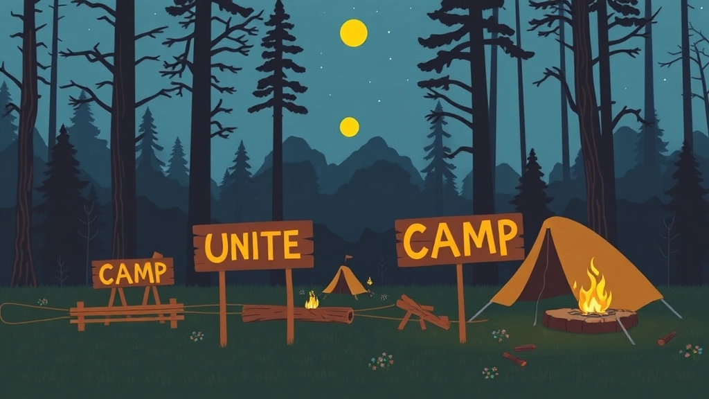
Ever wondered how to make your summer camp signs stand out?
I’ve got you covered.
Let’s dive into some inspirational examples that’ll get your creative juices flowing.
Why Do We Need Inspirational Summer Camp Signs?
You might be thinking, “Why bother with fancy signs?”
Well, here’s the deal:
- First Impressions Matter: A well-designed sign is the first thing campers and parents see.
- Guidance: They help in navigating the camp.
- Vibe: They set the tone and mood for the camp.
Classic Wooden Signs
Wooden signs scream summer camp.
They’re timeless.
- Rustic Charm: They bring a natural, earthy feel.
- Durability: They last long and withstand weather conditions.
- Customisable: Paint them, carve them, or even burn designs into them.
Example: The Campfire Sign
Picture this:
A large wooden sign with a carved campfire and the camp’s name.
Simple, yet effective.
Colourful Banners
Banners bring the party.
- Vibrant: Use bright colours to attract attention.
- Flexible: Easy to move around and change.
- Cost-Effective: Great for those on a budget.
Example: Welcome Banner
Imagine a large, colourful banner at the entrance saying, “Welcome to Adventure Camp!”
Instant excitement.
Chalkboard Signs
Chalkboards are versatile.
- Editable: Change the message whenever you want.
- Interactive: Let campers add their own messages.
- Retro Vibe: They have a cool, vintage feel.
Example: Daily Schedule Chalkboard
A big chalkboard listing the day’s activities.
Parents love it.
Kids love it.
Everyone’s in the loop.
Digital Signs
Yes, even camps can go digital.
- Dynamic: Change messages with a click.
- Engaging: Add videos or animations.
- Modern: Perfect for tech-savvy camps.
Example: Digital Welcome Board
A screen at the entrance showing a welcome video and the camp’s highlights.
High-tech and high-impact.
Themed Signs
Match your signs to your camp’s theme.
- Consistency: Keeps the look and feel uniform.
- Fun: Adds to the overall experience.
- Memorable: Makes your camp stand out.
Example: Pirate Camp
For a pirate-themed camp, use signs shaped like treasure maps or pirate flags.
Arrr matey, it’s a hit!
Hand-Painted Signs
Hand-painted signs add a personal touch.
- Unique: No two signs are the same.
- Creative: Let your artistic side shine.
- Engaging: Campers can help create them.
Example: Camper Creations
Set up a sign-painting activity.
Use the signs around the camp.
It’s a win-win.
Looking for more tips on summer camp signs?
Check out our guide on DIY Summer Camp Signs: Step-by-Step Guide.
Happy camping!
Where to Buy Pre-Made Summer Camp Signs
Alright, so you’re knee-deep in summer camp prep, and the last thing you want to worry about is making signs from scratch. I get it. You want something quick, easy, and effective. So, where do you get pre-made summer camp signs that don’t look like they belong in a bargain bin? Let’s dive in.
Top Spots to Buy Pre-Made Summer Camp Signs
1. Amazon
Amazon is the go-to for almost everything, right? And summer camp signs are no exception. From rustic wooden signs to vibrant, colourful banners, Amazon’s got a wide range. Plus, with Prime, you can get them delivered super fast. Just make sure to read the reviews and check the dimensions.
2. Etsy
Etsy is a goldmine for unique, handcrafted signs. If you want something that feels a bit more personal and less mass-produced, this is your spot. You can find customisable options, too, which is great if you want to add your camp’s name or a specific message.
3. Party City
Party City isn’t just for birthday balloons and Halloween costumes. They have a decent selection of pre-made signs perfect for summer camps. Think bright, fun, and kid-friendly designs. Plus, you can often find seasonal discounts.
4. Sign Shops
Local sign shops are another excellent option. Many of them offer pre-made signs that you can buy off the shelf. Plus, supporting local businesses always feels good. You might even be able to get a discount if you buy in bulk.
5. Online Sign Retailers
Websites like Vistaprint and Zazzle offer a range of pre-made signs. They often have templates you can tweak a bit to fit your needs. The quality is usually top-notch, and they offer various material options.
Things to Consider When Buying Pre-Made Summer Camp Signs
Before you hit that ‘Buy Now’ button, keep these in mind:
- Durability: Is the sign going to survive the summer heat, unexpected rain, and enthusiastic campers?
- Visibility: Can it be seen from a distance? Bright colours and large fonts are your friends here.
- Portability: Will you need to move the sign around? If so, lightweight materials are key.
- Cost: What’s your budget? Sometimes spending a bit more upfront saves you money in the long run.
Real Talk: My Experience with Pre-Made Signs
Last summer, I was in a pinch and needed signs ASAP. I ordered a set from Amazon, and while they were decent, they didn’t quite have the personal touch I was hoping for. So, I ended up grabbing a few custom pieces from Etsy. The kids loved the unique designs, and it made the camp feel more special. Lesson learned: sometimes it’s worth mixing and matching.
Got any favourite spots for buying signs? Share them with us! And remember, the right sign can make all the difference in setting the vibe for your camp.
For more tips on creating the perfect summer camp experience, check out our guide on summer camp cabin safety and design tips. If you’re looking for fun activities to keep campers engaged, don’t miss our top summer camp games and activities guide.
Happy camping!
Incorporating Technology into Summer Camp Signage
Ever thought about how to make your summer camp signs pop?
I mean, really stand out.
Well, let’s talk tech.
Incorporating technology into summer camp signage can transform your camp’s vibe.
And it’s not as complicated as it sounds.
So, why should we care about tech in signs?
Grabbing Attention
Kids today are all about screens.
Why not use that to your advantage?
Dynamic Content
Static signs are so last decade.
With tech, you can update info in real-time, making it as engaging as a summer camp schedule.
Interactive Experience
Make it fun.
Engage the kids with interactive elements, similar to a volleyball game at camp.
Types of Tech to Consider
Digital Displays
Think LED signs or digital billboards.
They’re bright, eye-catching, and versatile.
QR Codes
Super easy to implement.
Kids can scan them for maps, schedules, or fun facts.
Augmented Reality (AR)
This one’s a bit more advanced but so cool.
Imagine kids pointing their phones at a sign and seeing a 3D camp mascot come to life.
Mobile Apps
Create a simple app for the camp.
Include maps, schedules, and a scavenger hunt.
How to Implement
Start Small
No need to go all out immediately.
Begin with digital displays or QR codes.
Test the waters.
Get Feedback
Ask the kids what they like.
Adjust based on their input.
Budget Wisely
Tech can be pricey.
Look for cost-effective solutions.
Consider renting equipment.
Real-World Examples
Camp Sunshine
They used digital signs to display daily schedules and weather updates.
Kids loved it.
Happy Trails Camp
Implemented QR codes for a scavenger hunt.
It was a hit.
Safety First
Secure Your Tech
Make sure your tech is safe from the elements and tampering.
Clear Instructions
Kids need to know how to use the tech.
Keep it simple.
FAQs About Summer Camp Signs
What makes a summer camp sign effective?
An effective summer camp sign should have clear messaging, an eye-catching design, and include all relevant information such as camp name, dates, times, contact info, and location details. It should also be consistent with the camp’s theme, durable, accessible, and placed in high-traffic areas.
What materials should I use for my summer camp sign?
Your choice of materials depends on whether the sign will be indoors or outdoors. For outdoor signs, consider weather-resistant wood like cedar or redwood, aluminium, or PVC/acrylic. For indoor signs, foam board, cardstock, and canvas are good options.
How can I ensure my summer camp sign is safe?
To ensure safety, place signs away from high-traffic areas, secure them with strong anchors, use weather-proof materials, and make sure they are highly visible. Additionally, avoid sharp edges and perform regular maintenance checks.
Why are inspirational summer camp signs important?
Inspirational signs create a strong first impression, help with navigation, and set the tone for the camp. They can add to the overall experience and make the camp more memorable.
What are some design tips for creating an eye-catching summer camp sign?
Use bright colours, fun graphics, and unique shapes to make your sign stand out. Ensure the text is easy to read from a distance by using bold letters and simple words.
How can I make my summer camp sign accessible to everyone?
Use large fonts for visibility, simple language for clarity, and consider including Braille or audio options for inclusivity.
What should be included in the messaging of a summer camp sign?
The main message should be clear and easy to read. Include the camp name, dates, times, contact information, and location details. A strong call to action is also essential to guide the audience on what to do next.
Can you give an example of an effective summer camp sign?
Sure! A bright blue sign with big white letters and a cartoon sun wearing sunglasses that says, “Join Us for Summer Fun! June 1-30. Call 123-456-7890.” This sign is simple, effective, and memorable.
What are some creative types of summer camp signs?
Creative types of summer camp signs include classic wooden signs, colourful banners, chalkboard signs, digital signs, themed signs, and hand-painted signs. Each type brings its own unique charm and functionality.
How should I place my summer camp sign for maximum visibility?
Place your sign in high-traffic areas such as entrance gates, near main roads, and popular community spots. Ensure it is at eye level and free from obstructions for maximum visibility.
References
-
10 Tips for Effective Sign Design
-
10 Tips for Creating Effective Signs
-
Essential Elements of an Effective Sign

