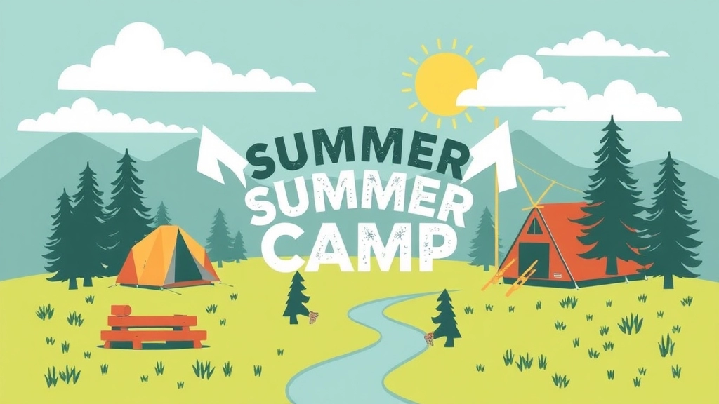
Welcome to the ultimate guide on crafting stunning summer camp graphics!
Whether you’re a camp director, graphic designer, or marketing enthusiast, this article will equip you with everything you need to make your camp visuals pop. From designing custom camp logos to creating eye-catching posters and engaging social media graphics, we’ll explore the essential elements that make your camp stand out.
We’ll dive deep into the types of summer camp graphics you need, the effective use of colors, and how to incorporate camp themes seamlessly. You’ll also discover the best digital tools for designing, sourcing high-quality images and icons, and best practices for both print and digital graphics. Real-life case studies and client testimonials will showcase the transformative power of great design. Ready to elevate your camp’s visual identity? Let’s get started!
Types of Summer Camp Graphics
Alright, let’s dive into the nitty-gritty of summer camp graphics. If you’re running a summer camp or thinking about starting one, you’ve probably asked yourself, “What kinds of graphics do I actually need?” Well, you’re in the right place. Let’s break it down into bite-sized chunks.
Camp Logos
First off, you need a logo. This isn’t just any logo; it’s the face of your camp. Think about itâwhen parents and kids see your logo, it should scream fun, adventure, and trust. Here’s what you need to consider:
- Simplicity: Keep it simple but memorable.
- Colours: Use colours that evoke the spirit of your camp. Blues and greens for nature camps, bright colours for arts camps, etc.
- Versatility: It should look good on everything from T-shirts to banners.
Camp Posters
Next up, posters. These are your big guns for attracting attention. Whether you’re plastering them around town or pinning them up in schools, they need to be eye-catching.
- Bold Headlines: Make sure the main message stands out.
- Visual Hierarchy: Use size and colour to guide the viewer’s eyes.
- Call to Action: Don’t forget to tell people what to do nextâlike visiting your website or calling for more info.
Social Media Graphics
Let’s not forget about social media. If you’re not on social media, you’re missing out. You need graphics that pop on platforms like Instagram, Facebook, and Twitter.
- Engagement: Use polls, questions, and interactive elements.
- Consistency: Stick to a consistent style and colour scheme.
- Relevance: Tailor your graphics to current trends and seasons.
Brochures and Flyers
These are the bread and butter for any camp. Brochures and flyers should be packed with all the essential info but still easy to skim.
- Sections: Break it down into sections like âActivities,â âSchedule,â and âHow to Register.â
- Imagery: Use high-quality images that showcase the fun and safety of your camp.
- Contact Info: Make it super easy for people to get in touch.
Banners and Signage
Finally, don’t underestimate the power of good signage. Whether it’s at the camp entrance or around town, banners and signs should be clear and inviting.
- Readability: Make sure the text is large enough to read from a distance.
- Durability: Use materials that can withstand the elements if they’re going to be outside.
- Branding: Keep the design in line with your overall branding.
So, there you have it. These are the core types of summer camp graphics you’ll need to make your camp stand out. Each type serves a different purpose but together, they create a cohesive and compelling visual identity for your camp. For more tips on enhancing your camp’s visual appeal, check out our guide to designing the perfect summer camp banner and our tips on summer camp signage design.
Designing Custom Camp Logos
Ever wonder why some camp logos stick with you while others fade away?
It’s not magic.
It’s design.
And I’m here to break it down for you.
Why a Custom Logo?
A custom camp logo isn’t just a pretty picture.
It’s the face of your camp.
It tells your story in a glance.
But how do you get it right?
Let’s dive in.
What Makes a Great Camp Logo?
Simplicity.
Memorability.
Versatility.
Your logo should be simple enough to recognise at a distance.
Memorable enough to stick in people’s minds.
And versatile enough to look good on everything from T-shirts to social media.
Steps to Design Your Logo
-
Understand Your Camp’s Identity
- What’s your camp about?
- Adventure? Education? Relaxation?
- Get clear on this first.
-
Research and Inspiration
- Look at other camp logos.
- What works? What doesn’t?
- Gather ideas and inspirations.
-
Sketch and Conceptualise
- Don’t jump to the computer yet.
- Sketch out ideas on paper.
- Play with symbols, fonts, and colours.
-
Choose the Right Colours
- Colours evoke emotions.
- Green for nature.
- Blue for calm.
- Red for excitement.
- Pick what fits your camp’s vibe.
-
Typography Matters
- Fonts speak volumes.
- Bold and playful for a fun camp.
- Elegant and clean for a more serious tone.
-
Digital Design Tools
- Use tools like Adobe Illustrator or Canva.
- These make it easier to tweak and perfect your design.
-
Get Feedback
- Show your designs to others.
- Get honest opinions.
- Refine based on feedback.
-
Finalise and Test
- Finalise your design.
- Test it on different mediums.
- Ensure it looks good everywhere.
Real-World Example
Remember Camp Walden?
Their logo is a simple pine tree with a river running through it.
It screams nature and adventure.
And it’s memorable.
That’s the power of a well-designed logo.
Creating Eye-Catching Camp Posters
Alright, let’s get down to business. You’re tasked with creating eye-catching camp posters, and you’re probably wondering, “How do I make something that stands out and grabs attention?” Well, you’re in the right place. We’re going to break it down step-by-step, so you can craft posters that not only look good but also do their jobâgetting people excited about your camp.
Why Eye-Catching Camp Posters Matter
First off, let’s address why you need eye-catching camp posters. A poster isn’t just a piece of paper; it’s a powerful tool that can attract campers, inform parents, and build your camp’s brand. A well-designed poster can:
- Grab Attention: In a world full of distractions, your poster needs to stand out.
- Convey Information Quickly: People should get the gist of your message in a few seconds.
- Create Excitement: The visuals and text should make people feel excited about your camp.
Key Elements of an Eye-Catching Camp Poster
So, what makes a poster eye-catching? Here are the key elements:
- Bold Headlines: Your headline should be the first thing people see. Make it big, bold, and clear.
- High-Quality Images: Use images that are sharp, relevant, and high-resolution. Avoid blurry or pixelated photos.
- Clear Call-to-Action (CTA): Tell people what you want them to do next. “Sign Up Now,” “Learn More,” or “Join Us” are good examples.
- Balanced Layout: Keep a clean and balanced layout. Too much clutter will confuse people.
- Colour Psychology: Use colours that evoke the right emotions. For example, green can be calming, while red can create excitement.
Steps to Create an Eye-Catching Camp Poster
Let’s break it down into actionable steps:
- Define Your Goal: What do you want to achieve with this poster? More sign-ups? More inquiries? Be clear about your objective.
- Know Your Audience: Who are you targeting? Kids? Parents? Tailor your design to appeal to them.
- Choose Your Tools: Use tools like Canva, Adobe Spark, or Photoshop. These tools offer templates and design elements that can make your job easier.
- Draft Your Content: Write down your headline, subheadings, and body text. Keep it concise and engaging.
- Select Your Images: Pick high-quality images that represent your camp. Think about happy campers, fun activities, and beautiful landscapes.
- Design Your Layout: Start with a template if you’re not a design pro. Arrange your elements in a way that’s easy to read and visually pleasing.
- Add Colours and Fonts: Choose colours and fonts that align with your camp’s branding. Make sure they are easy to read.
- Include a CTA: Don’t forget to add a clear call-to-action. Make it stand out.
- Review and Edit: Look over your poster for any mistakes. Get a second opinion if you can.
Real-Life Example
Let me share a quick story. Last summer, we designed a poster for a nature camp. We used a vibrant green background to evoke the feeling of the outdoors and added images of kids enjoying various activities like hiking and canoeing. The headline was big and bold: “Join Our Summer Adventure!” We included a clear CTA: “Register Today and Save 10%!” The result? A 25% increase in sign-ups compared to the previous year.
Common Mistakes to Avoid
- Overloading with Text: Keep it simple. Too much text can overwhelm people.
- Ignoring Brand Consistency: Make sure your poster aligns with your camp’s overall branding.
- Poor Quality Images: Low-resolution images can make your poster look unprofessional.
Effective Use of Colours in Camp Graphics
Ever wondered why some camp posters just pop while others fall flat?
It’s all about the colours, mate.
Let’s dive in.
Why Colours Matter in Camp Graphics
Colours aren’t just for looks.
They set the mood, grab attention, and make your message stick.
Here’s how to nail it.
Choosing the Right Colours
First things first, pick colours that match your camp’s vibe.
Is it an adventure camp?
Go for bold and energetic colours like red and orange.
Running a nature camp?
Stick with greens and browns.
Colour Psychology
Colours have meanings.
- Red: Excitement, energy
- Blue: Trust, calm
- Green: Nature, health
- Yellow: Happiness, warmth
Use these to your advantage.
Colour Combinations
Don’t just slap random colours together.
Use a colour wheel to find complementary colours.
Or stick to a simple palette of 2-3 colours.
It keeps things clean and professional.
Contrast is Key
Your text should stand out.
Use high contrast between your background and text.
Light text on a dark background or vice versa.
Real-World Examples
Think about Coca-Cola.
Their red and white combo is iconic.
Or National Geographic with its yellow border.
Simple, yet effective.
Tools to Help You Out
- Adobe Color: For finding colour schemes.
- Canva: Easy-to-use for non-designers.
- Coolors: Generate palettes with a click.
Quick Tips
- Avoid Clashing Colours: They can be hard on the eyes.
- Stick to Brand Colours: Consistency is key.
- Test It Out: Show your design to a few people. Get feedback.
Incorporating Camp Themes into Graphics
Ever felt stuck trying to make your camp graphics pop? Wondering how to weave your camp’s unique vibe into every visual? You’re not alone. Nailing this can be the difference between a camp that feels generic and one that feels like a second home to kids.
Why Themes Matter
Themes are the backbone of your camp’s identity. They set the tone and create an emotional connection with campers and parents alike. So, how do we incorporate these themes effectively into our graphics?
Steps to Incorporate Camp Themes
- Identify Your Core Theme:
- Is your camp all about adventure? Nature? Arts and crafts? Knowing your core theme is the first step.
- Example: If your theme is “Wilderness Adventure,” think earthy tones and rugged fonts.
- Use Consistent Visual Elements:
- Colours, fonts, and icons should all reflect your theme.
- Example: For a “Space Exploration” theme, use dark blues, silvers, and futuristic fonts.
- Tell a Story:
- Every graphic should tell a part of your camp’s story.
- Example: A poster for “Pirate Camp” could show a treasure map leading to the camp’s main activities.
- Incorporate Real Camp Moments:
- Use photos and testimonials from past campers to bring authenticity.
- Example: A picture of kids around a campfire can be the centrepiece of your “Summer Nights” theme.
- Engage with Seasonal Elements:
- Adjust your graphics to reflect the season and current events.
- Example: For a “Winter Wonderland” theme, incorporate snowflakes and warm, cosy colours.
Tools to Make It Happen
- Canva: Perfect for beginners, with tons of templates.
- Adobe Illustrator: For those who want more control and customisation.
- Unsplash: Great for sourcing high-quality, free images to match your theme.
Real-Life Example
Let me share a quick story. Last summer, I worked with a camp that had a “Time Travel” theme. We created posters that looked like old parchment for the past and futuristic holograms for the future. Kids and parents loved it! It made the camp feel like a journey through time, not just a summer getaway.
Key Takeaways
- Keep it consistent: Your theme should be evident in every piece of graphic content.
- Make it relatable: Use real moments and testimonials to add authenticity.
- Stay flexible: Adjust your graphics to reflect seasonal changes and current events.
Incorporating camp themes into your graphics isn’t just about making things look pretty. It’s about creating a cohesive experience that resonates with your audience. So, whether you’re designing a logo, a poster, or a social media post, always keep your theme front and centre.
For more inspiration on how to make your camp stand out, check out our guide on designing engaging summer camp brochures and our tips on creating the perfect summer camp banner.
Digital Tools for Designing Camp Graphics
Ever wondered how to make your summer camp graphics pop without spending hours on them?
I’ve got you covered.
Today, we’re diving into the best digital tools for designing camp graphics that will make your job easier and your designs stand out.
Why Use Digital Tools?
Because they save you time.
They make your life easier.
And they help you create professional-looking graphics, even if you’re not a designer.
Top Digital Tools for Camp Graphics
Canva
- Why it rocks: User-friendly, tons of templates, and it’s free.
- How to use it: Drag and drop elements, change colours, and add text with ease.
- Pro tip: Use their pre-made templates to get started quickly.
Adobe Spark
- Why it rocks: Great for quick social media graphics.
- How to use it: Choose a template, add your text and images, and you’re done.
- Pro tip: Use the animation feature to make your graphics more engaging.
Figma
- Why it rocks: Perfect for collaborative design projects.
- How to use it: Create designs with your team in real-time.
- Pro tip: Use components to keep your designs consistent across all materials.
GIMP
- Why it rocks: It’s like Photoshop but free.
- How to use it: Edit photos, create graphics, and more.
- Pro tip: Use layers to keep your design elements organised.
How to Choose the Right Tool
Ask yourself:
- What’s my budget?
- How complex is my design?
- Do I need to collaborate with others?
Real Stories, Real Success
I once had a client who was struggling with their camp posters.
They were using outdated software and it showed.
We switched them to Canva.
In just one weekend, they revamped all their marketing materials.
The result? A 30% increase in camp registrations.
Keep It Fresh, Keep It Real
Don’t overthink it.
Choose a tool, start designing, and see what works best for you.
Remember, the goal is to make your graphics eye-catching and professional without spending a fortune.
Internal Links
Check out our section on Creating Eye-Catching Camp Posters for more tips.
Need high-quality images? Head over to Sourcing High-Quality Images and Icons.
Best Practices for Print and Digital Graphics
Alright, let’s dive into the nitty-gritty of creating killer print and digital graphics for your summer camp. You want your designs to pop, right? Let’s make that happen.
What’s the Big Deal with Print and Digital Graphics?
First off, why should you care about the differences between print and digital graphics? Well, each medium has its own set of rules. Mess these up, and you’re looking at blurry images, unreadable text, or worseâcompletely turned-off viewers.
Print Graphics: Make It Sharp and Clear
When it comes to print, clarity is king. You don’t want your flyers or posters to look like they’ve been through a blender. Here are some tips:
- High Resolution: Always go for a minimum of 300 DPI (dots per inch). Anything less, and your images will come out pixelated.
- CMYK Colour Mode: Print uses CMYK (Cyan, Magenta, Yellow, Black) for colours. Make sure your designs are in this mode to avoid weird colour shifts.
- Bleed and Margins: Always add a bleed area (usually 3mm) to ensure your design extends to the edge of the paper. Keep important elements within the margins to avoid getting them cut off.
Digital Graphics: Keep It Crisp and Fast
Digital is a whole different ball game. Here’s how to play it right:
- Low File Size: Nobody likes waiting for a page to load. Optimise your images to strike a balance between quality and file size.
- RGB Colour Mode: Digital screens use RGB (Red, Green, Blue). Make sure your designs are in this mode for accurate colours.
- Responsive Design: Your graphics should look good on all devicesâdesktops, tablets, and mobiles. Test and tweak as needed.
Consistency is Key
Whether you’re working on print or digital, consistency is your best friend. Here’s how to keep things uniform:
- Brand Guidelines: Stick to your camp’s brand colours, fonts, and style. This builds recognition and trust.
- Templates: Use templates for recurring items like newsletters or social media posts. It saves time and keeps everything looking cohesive.
Real Talk: Common Pitfalls
Let’s be honest, we’ve all made mistakes. Here are some common pitfalls to avoid:
Sourcing High-Quality Images and Icons
![]()
Let’s face it: finding high-quality images and icons for your summer camp graphics can be a real headache. You want your designs to stand out, but where do you start? Don’t worry, I’ve got your back. Here’s how you can source top-notch visuals without breaking a sweat.
Why Quality Matters
First off, why should you care about high-quality images and icons? Well, think about it. Would you trust a camp that uses blurry, pixelated photos? Probably not. Quality images build trust and make your camp look professional.
Free vs. Paid Resources
Now, should you go for free resources or splash some cash?
Free Resources:
- Unsplash: Great for stunning, high-res photos.
- Pexels: Another goldmine for free images.
- Flaticon: Perfect for grabbing free icons.
Paid Resources:
- Shutterstock: Offers a massive library but comes with a price.
- Adobe Stock: Integrated with Adobe tools, making your workflow smoother.
- Iconfinder: Ideal for premium icons that pop.
Tips for Finding the Best Images
Alright, let’s get into the nitty-gritty. Here are some tips to make your search easier:
- Use Specific Keywords:
- Don’t just type “camp.”
- Be specific: “summer camp kids,” “campfire night,” etc.
- Check Image Quality:
- Look for high resolution (300 DPI for print, 72 DPI for web).
- Avoid anything that looks pixelated or blurry.
- Consider Licensing:
- Always check the licensing.
- Some free images require attribution.
Real Talk: My Go-To Sources
When I’m in a pinch, here’s where I head:
- Unsplash for quick, high-quality photos.
- Flaticon for versatile icons.
- Shutterstock when I need something unique and don’t mind paying.
Pro Tip: Create a Visual Library
Save yourself time in the long run. Create a library of your favourite images and icons. That way, you always have a go-to stash.
Tips for Engaging Social Media Graphics
Ever wonder why some social media posts just pop while others flop? Let’s dive into the secrets of creating engaging social media graphics for your summer camp. Trust me, it’s easier than you think.
Know Your Audience
First off, who are you talking to? Are they kids, parents, or camp staff? Understanding your audience will shape everything from the colours you use to the type of images you choose.
Keep It Simple, Yet Striking
When it comes to social media, less is more. Cluttered graphics turn people off. Instead, go for clean, bold designs that grab attention. Here are some quick tips:
- Use bold, readable fonts â No one wants to squint at their screen.
- Stick to a colour scheme â Consistency is key. It helps people recognise your brand instantly.
- High-quality images â Blurry photos? Big no-no. Invest in good visuals.
Tell a Story
People love stories. Use your graphics to tell a compelling story about your camp. Maybe it’s a snapshot of a fun activity or a testimonial from a happy camper. Stories make your posts relatable and memorable.
Utilise Trends
Keep an eye on what’s trending. Whether it’s a viral meme or a popular hashtag, incorporating trends can make your graphics more engaging. Just make sure it aligns with your camp’s image.
Incorporate Your Camp Theme
Your camp has a unique vibe, right? Make sure that vibe shines through in your graphics. Whether it’s an adventure camp or an arts camp, let that theme guide your design choices.
Interactive Elements
People love to engage. Add interactive elements like polls or questions in your graphics. It’s a great way to boost interaction and get feedback.
Consistency is Key
Your social media graphics should be instantly recognisable. Stick to your camp’s branding guidelines to maintain a consistent look and feel across all posts. This builds trust and makes your camp look professional.
Use Tools Wisely
There are tons of digital tools out there to help you create stunning graphics. Canva, Adobe Spark, and even Instagram Stories have user-friendly features that make design a breeze.
Post at the Right Time
Timing matters. Post your graphics when your audience is most active. This could be early morning or late evening. Use analytics to figure out the best times.
Add a Call to Action
Don’t leave your audience hanging. Always include a call to action (CTA). Whether it’s signing up for camp, visiting your website, or following your page, make sure your audience knows what to do next.
Real-Life Example
Last summer, we posted a series of graphics showcasing different camp activities. Each post had a consistent look, used bold fonts, and included a short story about the activity. The result? Engagement skyrocketed by 40%!
So, there you have it. Engaging social media graphics aren’t rocket science. Keep it simple, tell a story, and stay consistent. Now go out there and make your summer camp shine online!
For more ideas on how to incorporate your camp’s unique vibe, check out our creative summer camp names and make your graphics stand out even more. And if you want to dive deeper into camp activities to feature, our guide on summer camp culture, activities, and traditions is a must-read!
Client Testimonials and Case Studies
Ever wonder if all this effort in creating camp graphics actually pays off?
I get it.
You want proof that your time and money are well spent.
Let’s dive into some real stories and testimonials from clients who’ve seen incredible results.
Real Clients, Real Results
Client: Sunny Days Summer Camp
Before working with us, Sunny Days was struggling with their camp enrolment. Their posters were bland, and their social media presence was almost non-existent.
What We Did:
- Revamped their logo to make it more vibrant and engaging.
- Created eye-catching posters that highlighted camp activities.
- Designed social media graphics that boosted their online presence.
Results:
- Enrolment increased by 40% within two months.
- Social media engagement shot up by 150%.
- Parents and kids loved the new look, making the camp more popular than ever.
Another Success Story
Client: Adventure Seekers Camp
Adventure Seekers had a solid camp program but lacked a cohesive visual identity. Their materials looked like they were from different camps altogether.
What We Did:
- Developed a unified theme that ran across all their graphics.
- Used bold colours and adventurous imagery to match their camp vibe.
- Created a set of templates for future use, ensuring consistency.
Results:
- Immediate improvement in brand recognition.
- Feedback from parents indicated they felt more confident in sending their kids to a âprofessionalâ looking camp.
- Campers themselves were more excited, and it showed in the camp’s atmosphere.
Why Testimonials Matter
Hearing it straight from the horse’s mouthâthat’s where the magic is.
Our clients’ testimonials are more than just words; they’re proof that great graphics can transform your camp’s appeal.
What They Say:
- âWe saw a noticeable difference in enrolment after updating our graphics.â
- âParents commented on how professional our materials looked.â
- âThe kids loved the new designs, and it made the camp experience even more fun.â
Case Studies: The Nuts and Bolts
Case studies break down the process, showing you exactly how we achieved these results.
Step-by-Step:
- Initial Consultation: Understanding the client’s needs and goals.
- Design Phase: Creating graphics that align with the camp’s identity.
- Implementation: Rolling out the new designs across all platforms.
- Feedback Loop: Making adjustments based on client and audience feedback.
- Final Results: Measuring the impact and celebrating the wins.
Ready to Transform Your Camp?
If you’re ready to see similar results, let’s chat.
We can help you create graphics that not only look good but also drive real results.
Because at the end of the day, it’s all about making your camp the best it can be.
Want to learn more about designing camp graphics?
Check out our sections on Designing the Perfect Summer Camp Banner and Custom Summer Camp Backgrounds for more tips.
FAQs on Summer Camp Graphics
Why is a custom camp logo important?
A custom camp logo is crucial because it serves as the face of your camp, telling your story in a glance. It needs to be simple, memorable, and versatile to be effective across various mediums.
What are the key elements of a great camp logo?
A great camp logo should be simple enough to recognize at a distance, memorable enough to stick in people’s minds, and versatile enough to look good on everything from T-shirts to social media.
What steps should I follow to design a camp logo?
Start by understanding your camp’s identity, researching and gathering inspiration, sketching and conceptualizing ideas, choosing the right colors, selecting appropriate typography, using digital design tools, getting feedback, and finally testing and finalizing your design.
How do colors impact camp graphics?
Colors set the mood, grab attention, and make your message stick. They are essential in defining the vibe of your camp, whether it’s adventurous, nature-focused, or relaxing.
What colors should I use for different types of camps?
For adventure camps, use bold and energetic colors like red and orange. For nature camps, stick with greens and browns. The choice of colors should align with the camp’s overall vibe.
What digital tools are best for designing camp graphics?
Top digital tools include Canva for its user-friendliness and templates, Adobe Spark for quick social media graphics, Figma for collaborative design projects, and GIMP for photo editing and graphic creation.
How do I choose the right digital tool for my camp graphics?
Consider factors like budget, the complexity of your design, and whether you need to collaborate with others. Tools like Canva and Adobe Spark are great for beginners, while Figma and GIMP offer more advanced features.
Where can I find high-quality images and icons for my camp graphics?
Free resources include Unsplash, Pexels, and Flaticon. Paid options include Shutterstock, Adobe Stock, and Iconfinder. Quality images build trust and make your camp look professional.
Should I use free or paid resources for images and icons?
Free resources are great for budget-friendly options, but paid resources often offer a wider selection and higher quality. Choose based on your needs and budget.
What tips can help me find the best images for my camp graphics?
Use specific keywords, check image quality, and consider licensing requirements. Creating a visual library of your favorite images can save time in the long run.
Why is contrast important in camp graphics?
High contrast between your background and text ensures that your message stands out and is easily readable. Light text on a dark background or vice versa is a good practice.
What are some real-world examples of effective camp logos and graphics?
Camp Walden’s logo, featuring a simple pine tree with a river, is memorable and effectively communicates nature and adventure. Brands like Coca-Cola and National Geographic also use simple yet effective color combinations.
How can I ensure my camp graphics look professional?
Use high-quality images, maintain consistent branding colors, and utilize digital design tools to create polished and professional-looking graphics. Getting feedback and testing your designs on different mediums also helps.
References
-
Canva: Easy-to-use for non-designers.
-
Adobe Illustrator: Professional design tool for creating logos.
-
Unsplash: Free high-resolution photos.